SEPT 2025 – APRIL 2026
ClownCult ChicagoDIGITAL MEDIA DESIGN
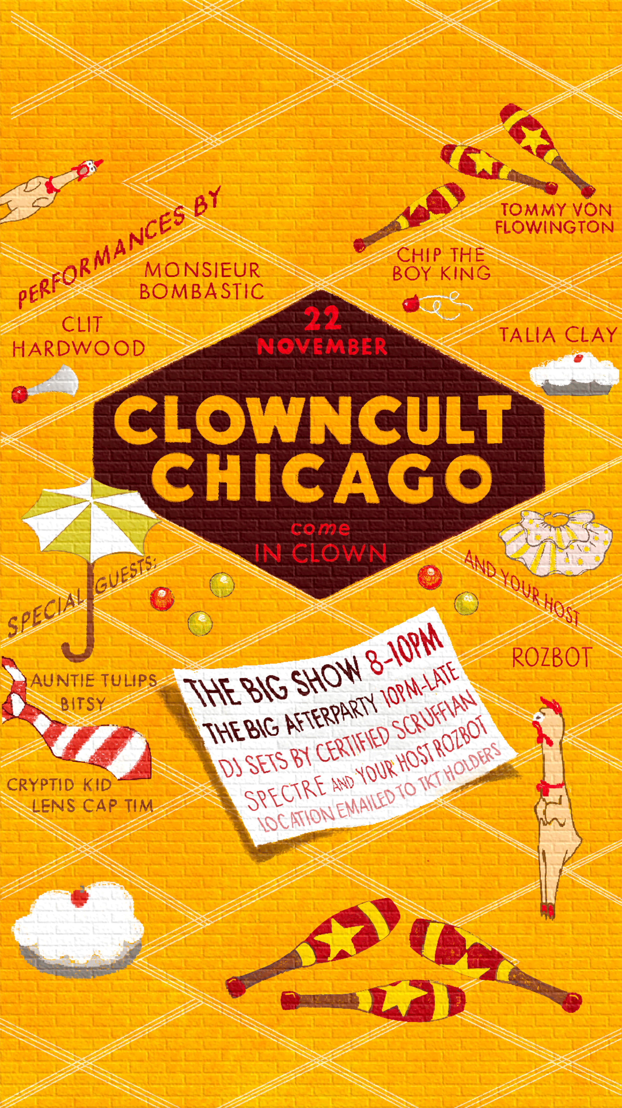
CLOWNCULT is described as, “a silly, sexy, clown party.”
It has been an honor to design the posters and digital assets for the first three events of the expanding community.
I’d say it’s part performance, part rave & ALL circus.
Starting in Brooklyn, the “cult” has expanded to the windy city under the guidance of R0zbot. Locally-based in Chicago, she reached-out with the inaugural date and some inspiration from previous posters.
The original Clowncult posters maintain a candid, do-it-yourself aesthetic. Loose formatting, brightly saturated hues, and hand-drawn type. Brush strokes were fast, textured and naive. The style was childlike and punk-rock. Immediately, it was important to maintain this visual language, but lend the newly-expanded event a touch of establishment.
What’s more serious than cooking?
At its core, to clown is to take something serious and make it silly; at least, that is the thesis of this design. Inspired by the fact this event was held a day after Thanksgiving, the illustration aims to incorporate the tediousness of a recipe book but through the lens of a clown.
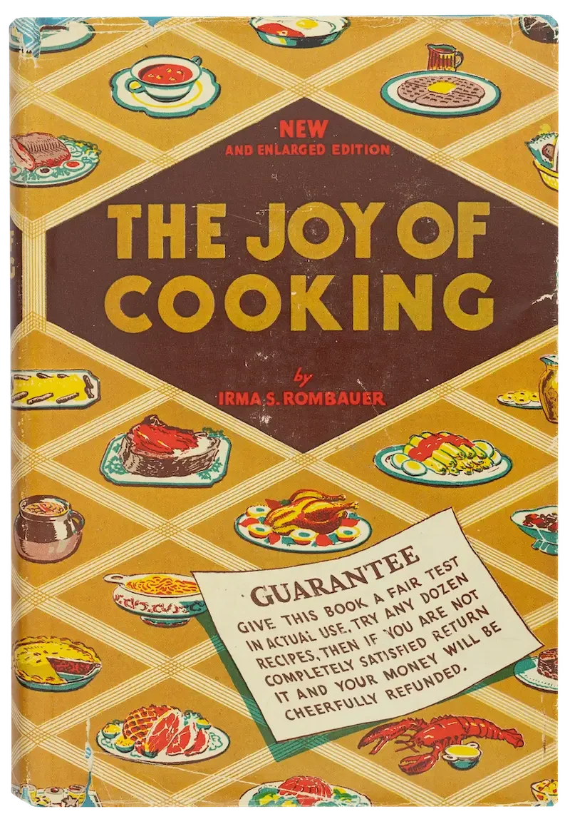
The 1943 edition of The Joy of Cooking has a cover composed of criss-crossing lines and cartoon entrees on serving platters, neatly spaced and aligned to the center of these cell-like diamonds—forming a grid. Since this design would feature many individual performers’ names, in addition to showtime logistics, the existing hierarchy solved that problem.
But what to do with the food? Initially, the idea was to turn each plate into a clown-head that looked like an entree. Thankfully, with feedback from the client, we shelved that idea for this event and opted for clown-props instead. As R0zbot pointed-out, she wasn’t serving THAT much food, and we definitely didn’t want a hoarde of hungry clowns at the door.
Though there’s mourning for the “chicago dog”, “ribeye”, “waffle”, and “tomato soup” clowns, plans for these ideas exist in the future.
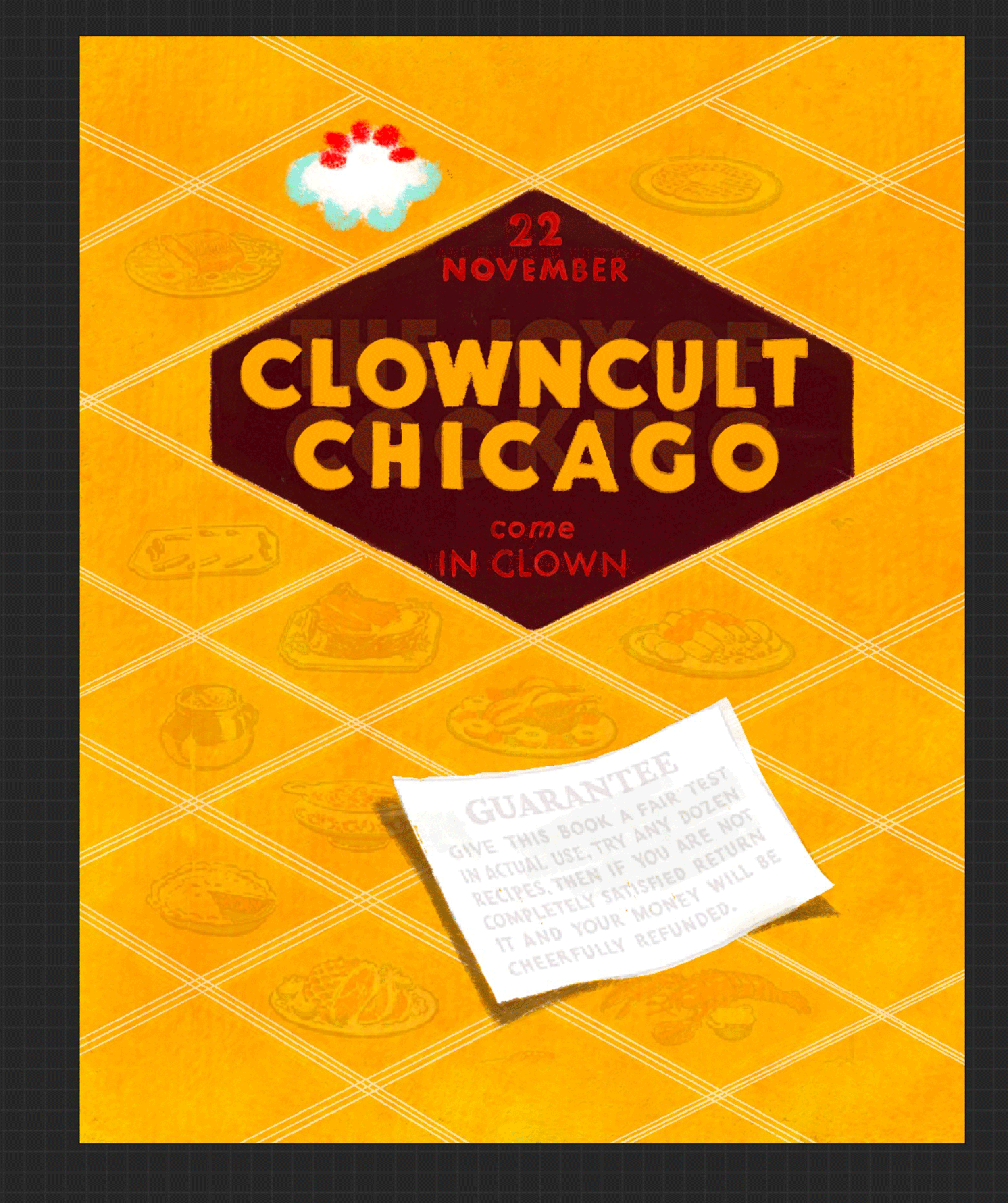
Last, a brick wall was added to the background for scale. With this simple texture, the scrawling pencil-like strokes felt like they were lined by a paintbrush on the side of a building. Since this would mainly be viewed on phone screens a brick-wall leant the illustrations a sense of place, age, and intention; instead of looking like a Markup-tool fail.
Like a mural by the stage-door, with its bright colors and boldly blocked title, the poster heralds a playful event that may look chaotic on its face but is established and well-organized behind the curtain:
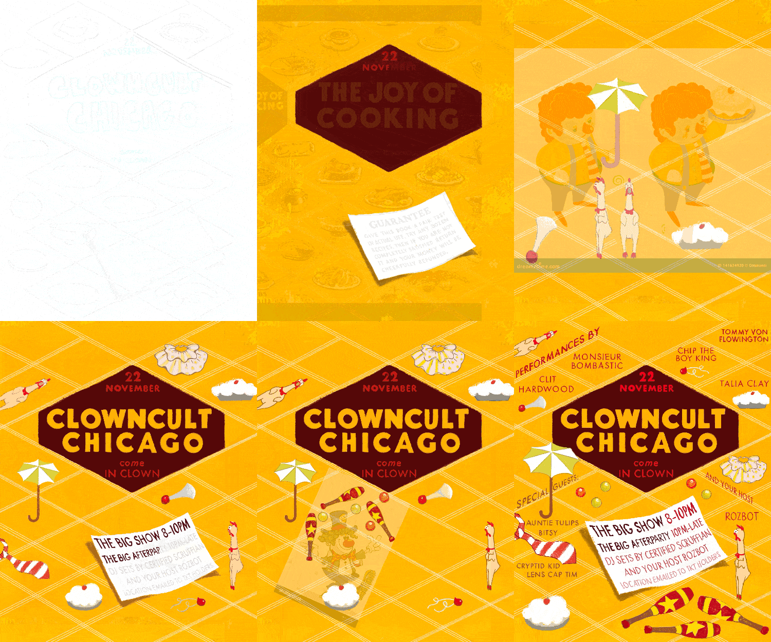
With a laundry-list of clown accoutrements sketching could begin. For consistency and legibility, I used Futura as the basis for the hand-lettered titles. Working exclusively in Procreate on iPad, more focus was placed on texture than for previous projects. Having a large variety of digital brushes meant more flexibility experimenting with drawing letters and illustrating; and being a raster-based app, there would be greater variation in strokes than if it were in Illustrator with vector-based pen tools.
To my delight, I was asked to design their next poster:
CLOWNCULT II: Electric Boogaloo
If you aren't familiar with this 1984 film, here…
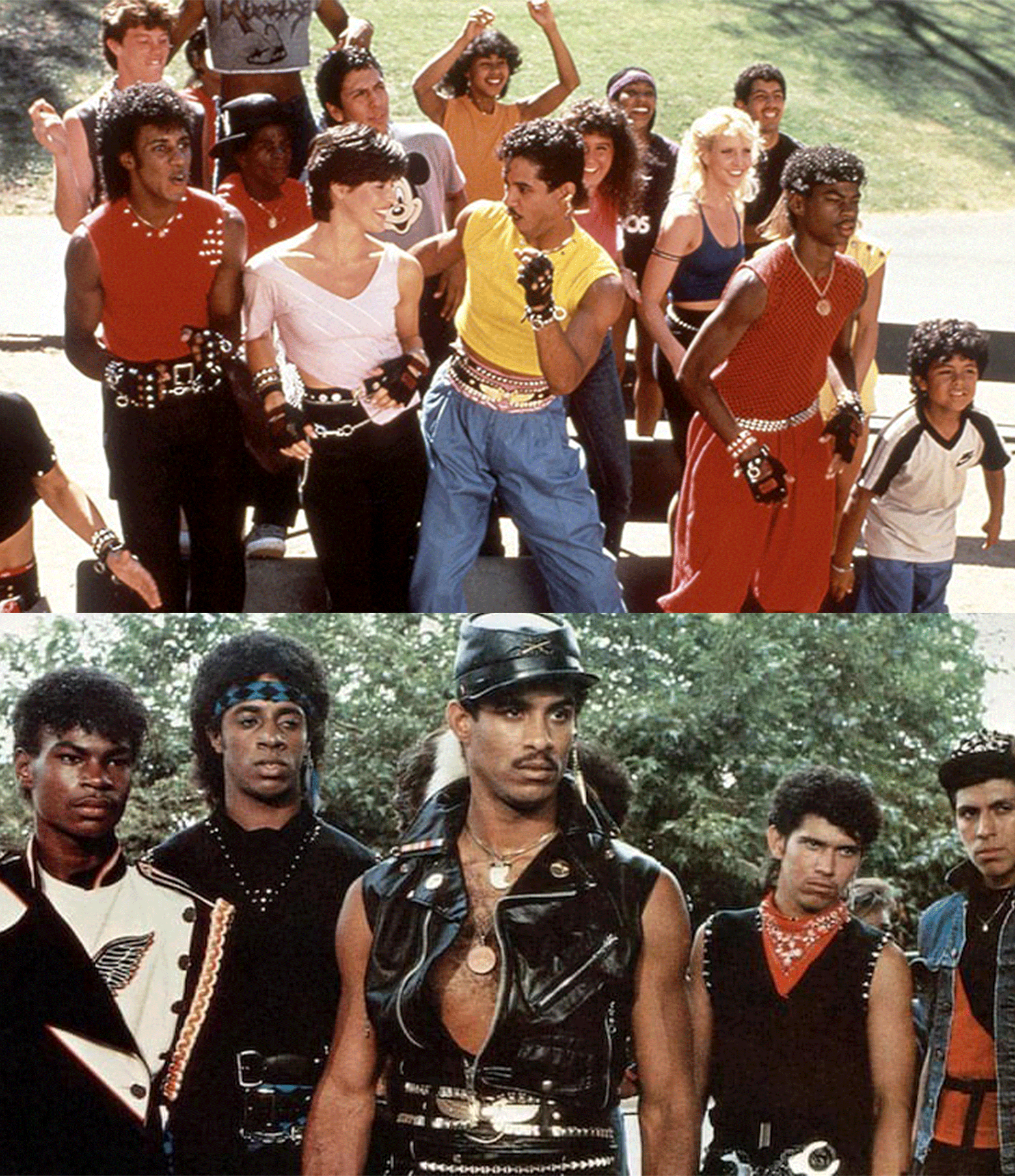
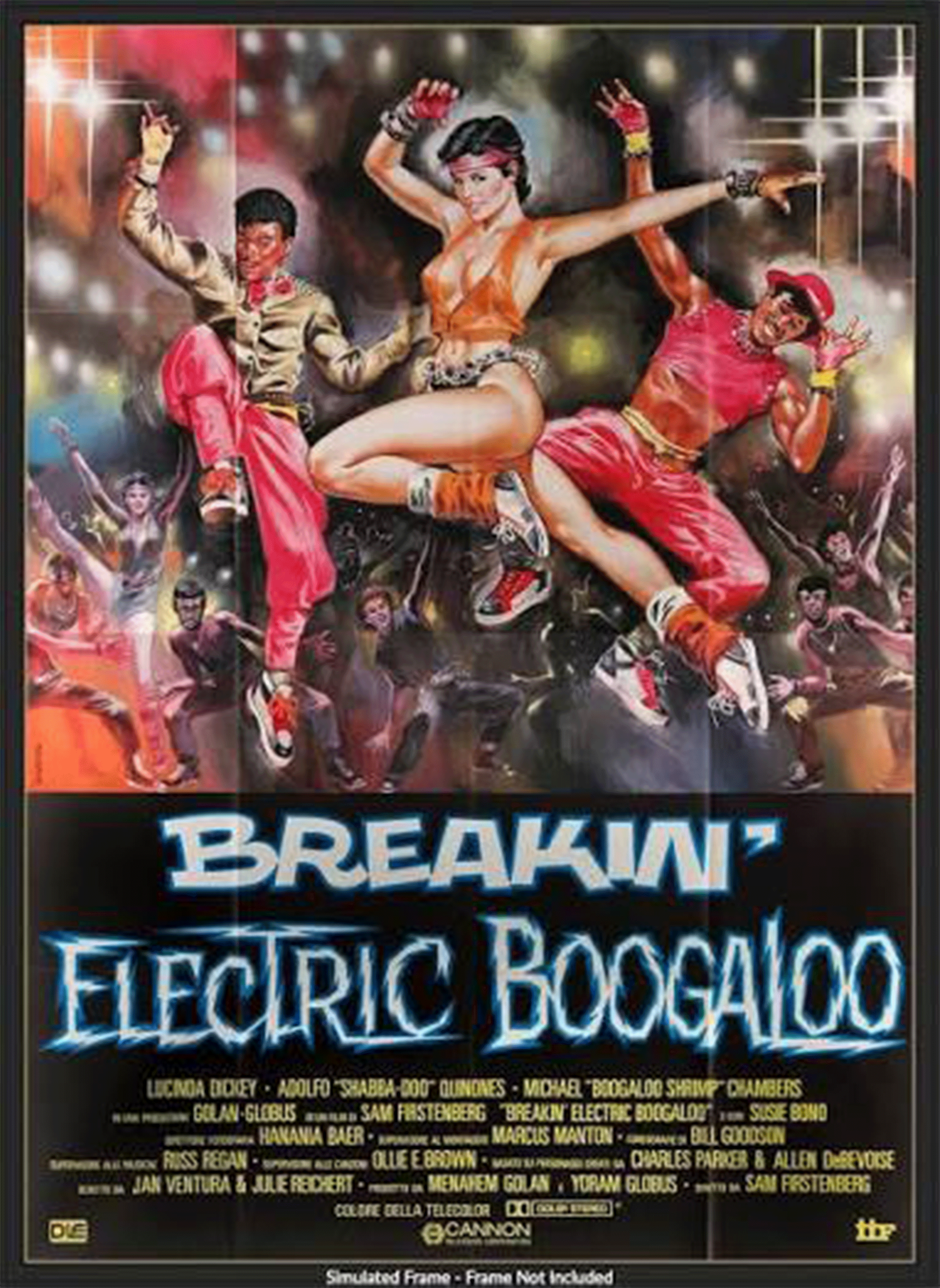
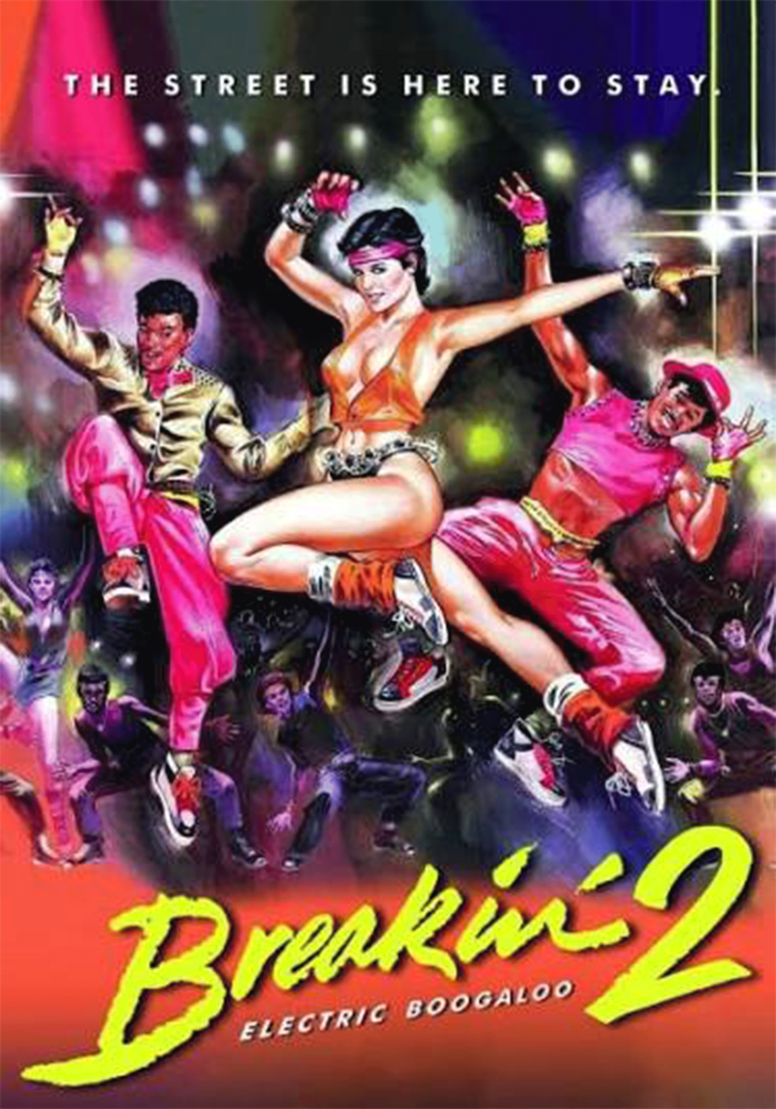
These images, along with the film’s posters, arrived in the inbox as inspo; before they went on to serve as dress code.
A campy, choreographed, eighties explosion—just add clowns!
It was clear there needed to be some sort of dancing clown present. In fact, many dancing clowns. But, it felt important to be true to the BK aesthetic, so there needed to be a hand-drawn, lo-fi aspect.
Enter many, many clipart clowns and generic dancing figurines. When remixed and drawn in Procreate these served as a base for all nineteen breakdancing minions. For the background, a galaxy and exploding stars above a wireframe Chicago skyline; their fine contour lines complimenting the outlined clown figurines. Another perspective grid references the first poster and creates a plane for our montage.
The font Duper emulated hand-lettering and paired nicely with New Astro Soft’s retro-futuristic aesthetic.
Much like the film, the poster feels as though it exists in the glow of a cathode ray tube. Thus the entire image was tweaked and texturized to produce that fuzzy, vertically-striped glow. For the title, ‘Electric Boogaloo,’ the font BD Caramel was perfect with its “bubble” variability.
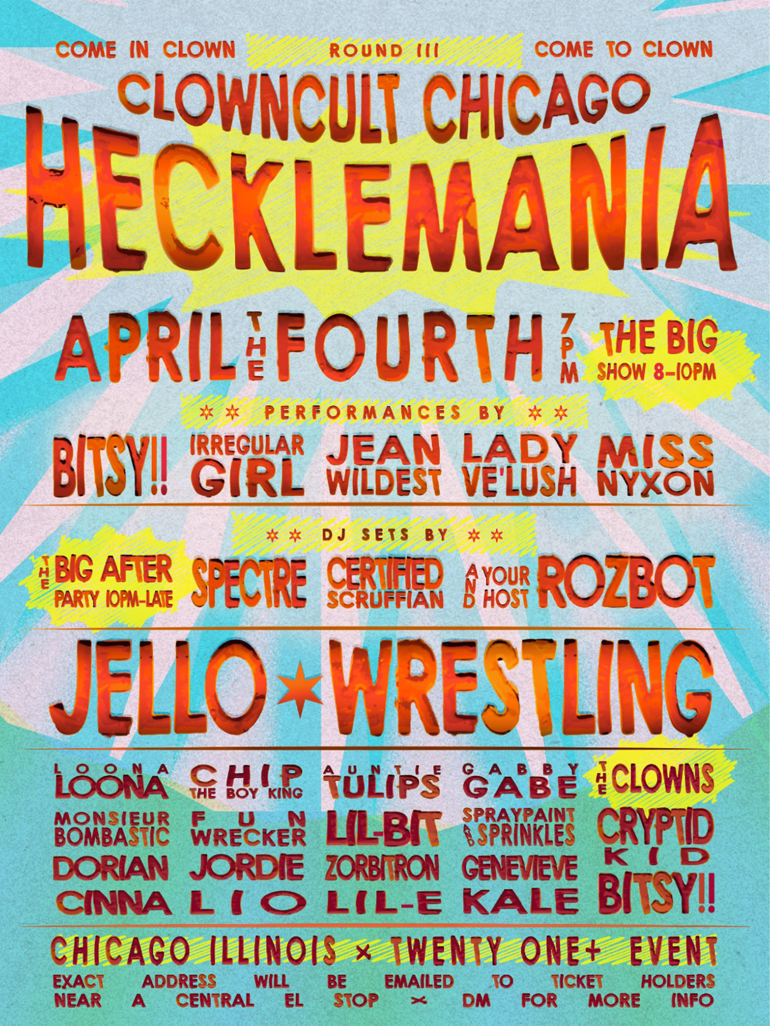
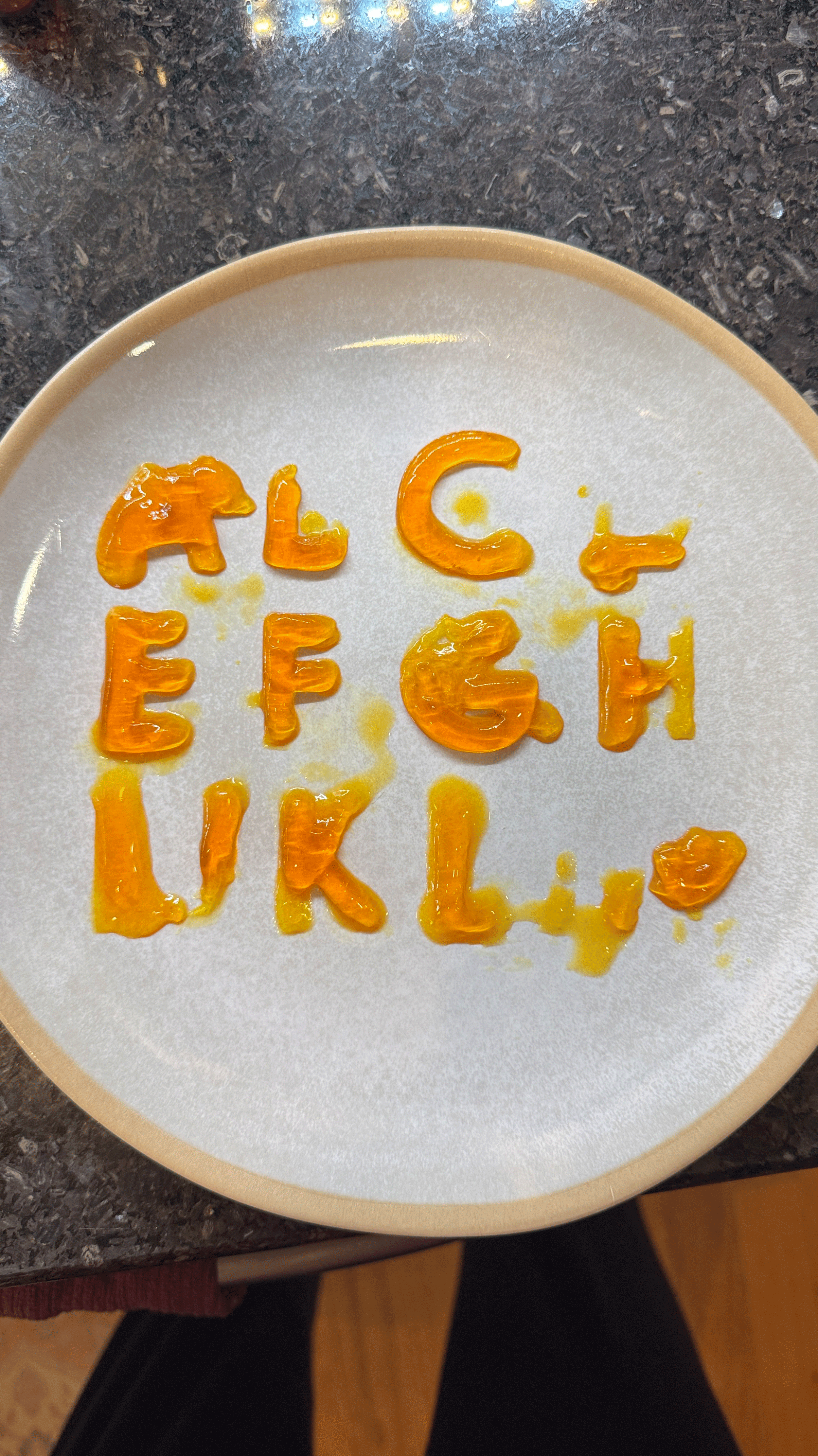
When I heard the first whispers of jello wrestling, one thing came to mind: Edible type. Three jars of gelatin later and I’m delivering…
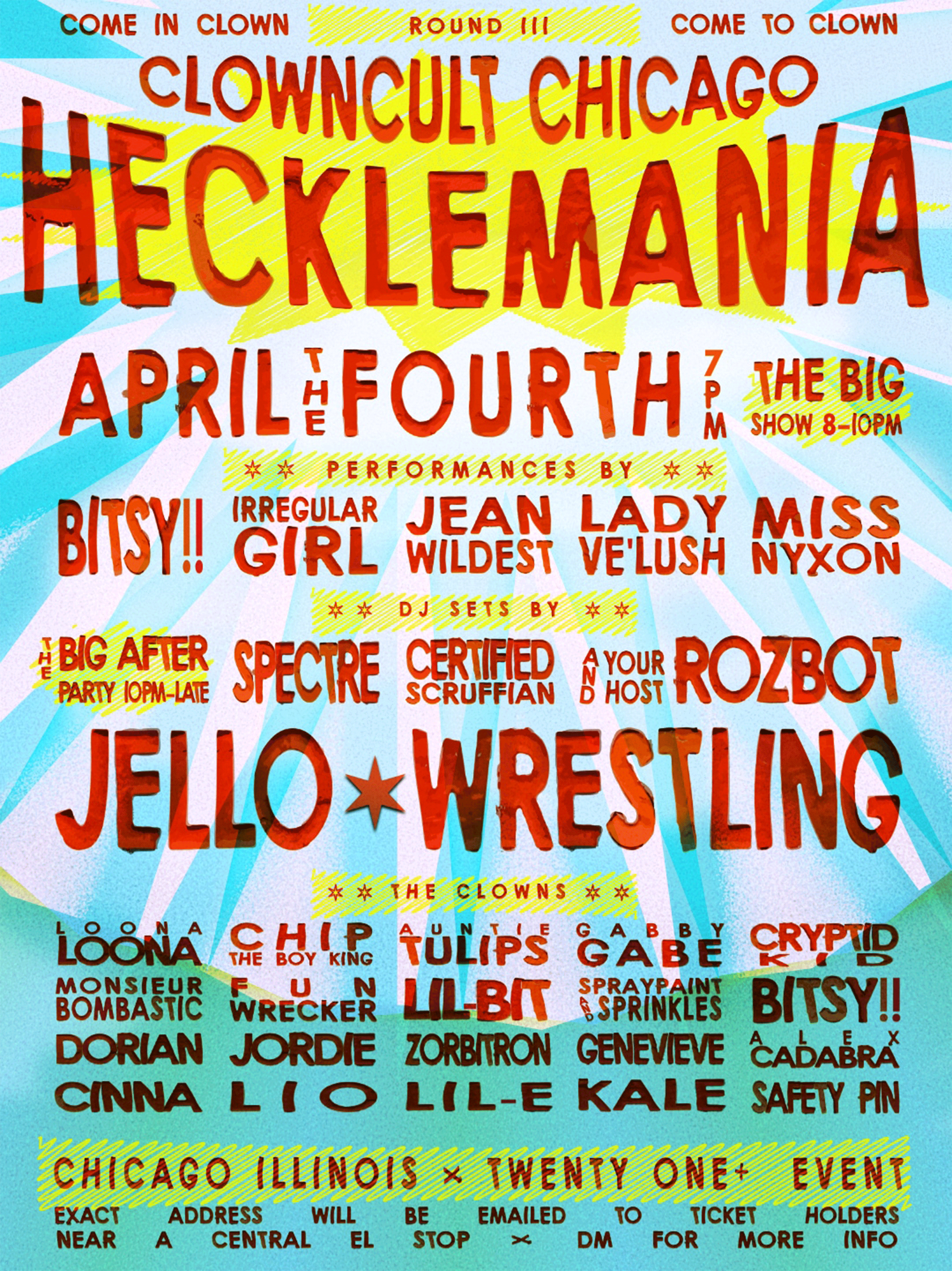
CLOWNCULT III: HECKLEMANIA
What could be sillier than a poster entirely in Jello?
The Final Draft
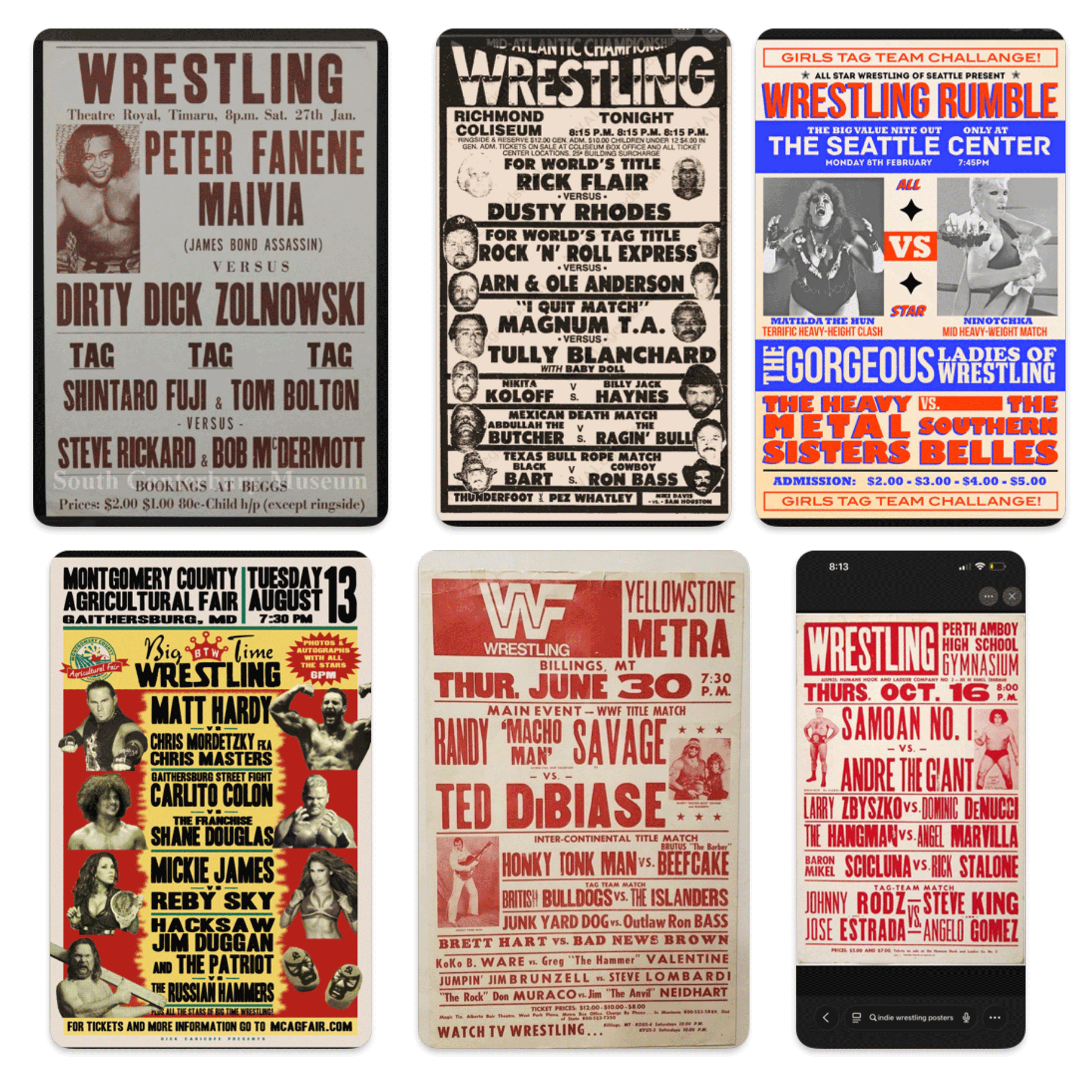
Having experimented with edible type, this felt like an opportunity to flesh-out my Queso Case project from 2022 at UIC. (If you ever interviewed a woman with cheese slices glued to her wall… Hi!) I knew I wanted the vibe of an indie-wrestling poster, and since the clowns likenesses were never featured on the poster, I would rely one-hundred percent on typography.
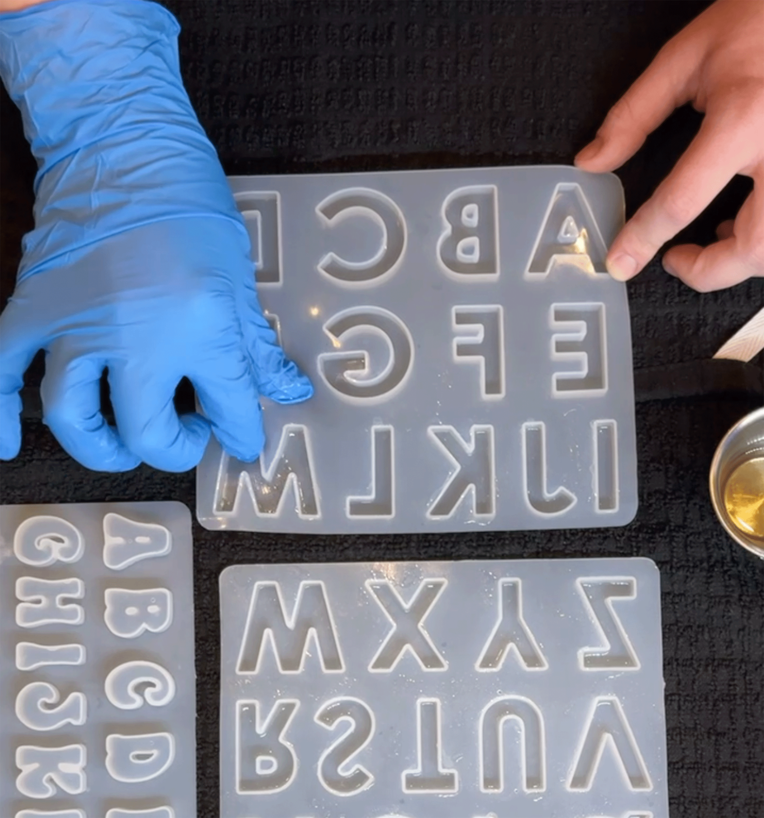
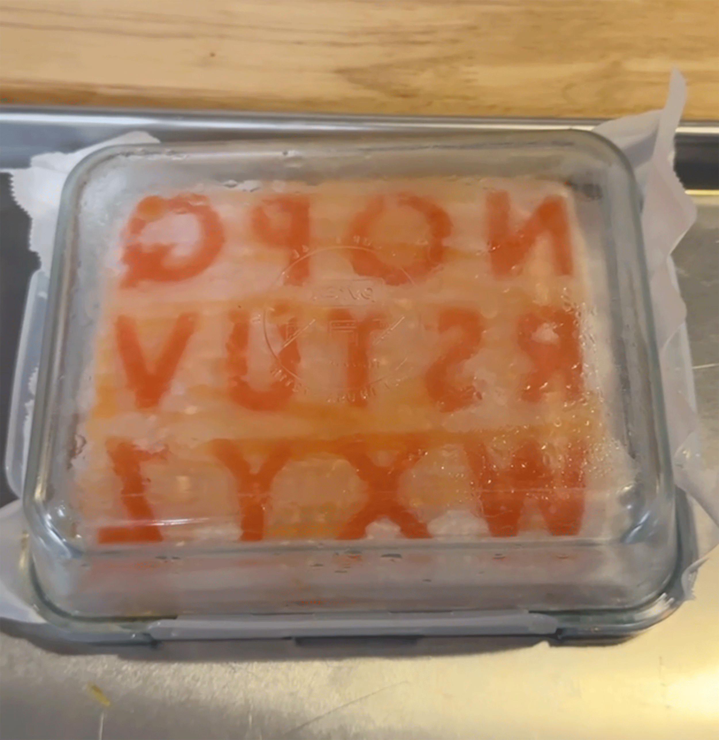
Starting with an everyday instant-gelatin, the liquid was poured into greased silicone molds and placed in a cool place until firm. After multiple tries with different flavors (colors), lubricants (coconut oil, cooking spray, quick-release treatment) and setting-conditions (varied time, location, temperature) the jello was stubborn to remove and quick to melt on the plate. Edges either stuck to the mold or the center seemed to evaporate. It became clear that grocery-store gelatin wasn’t durable enough. Time for the professional option.
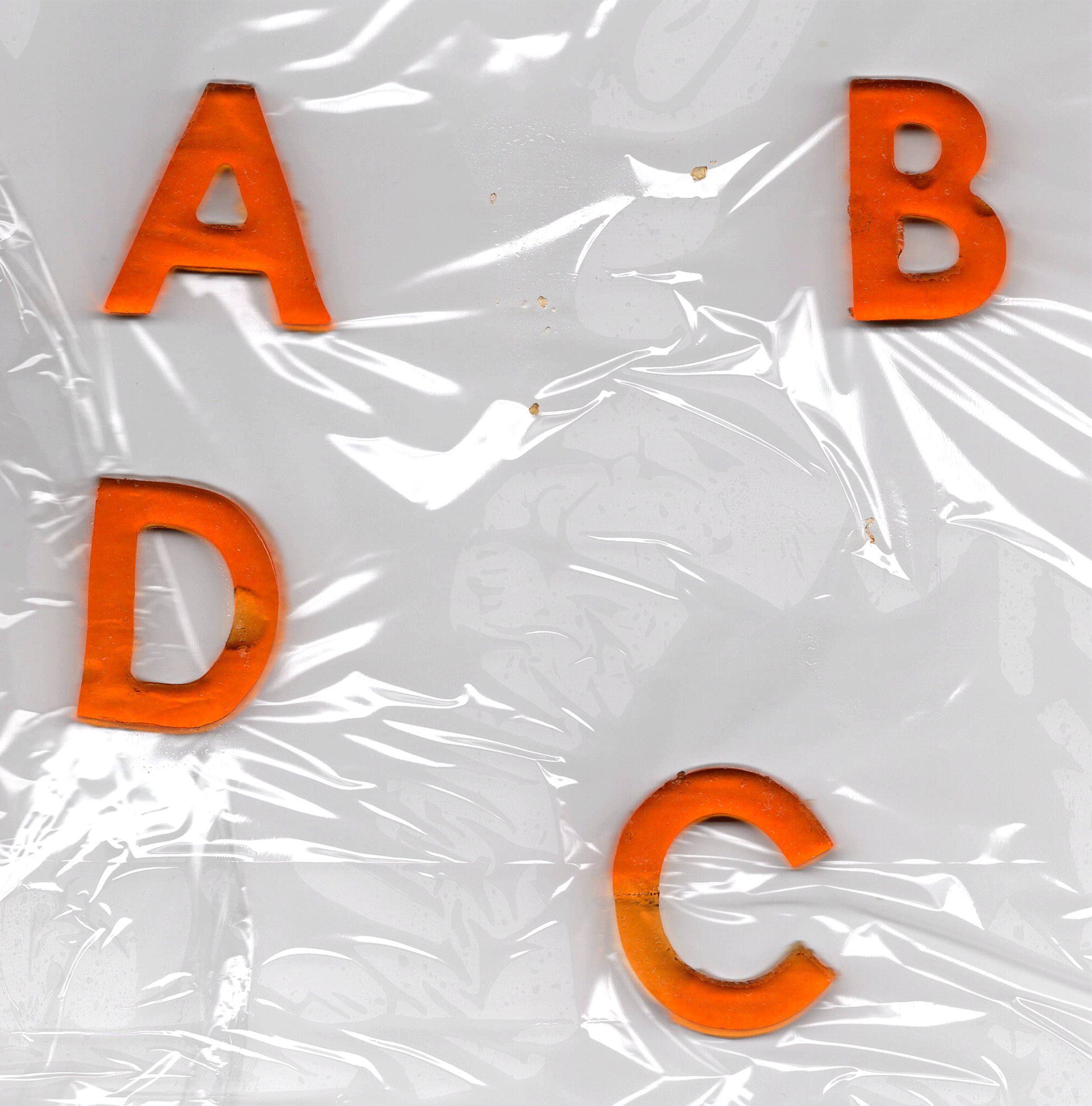
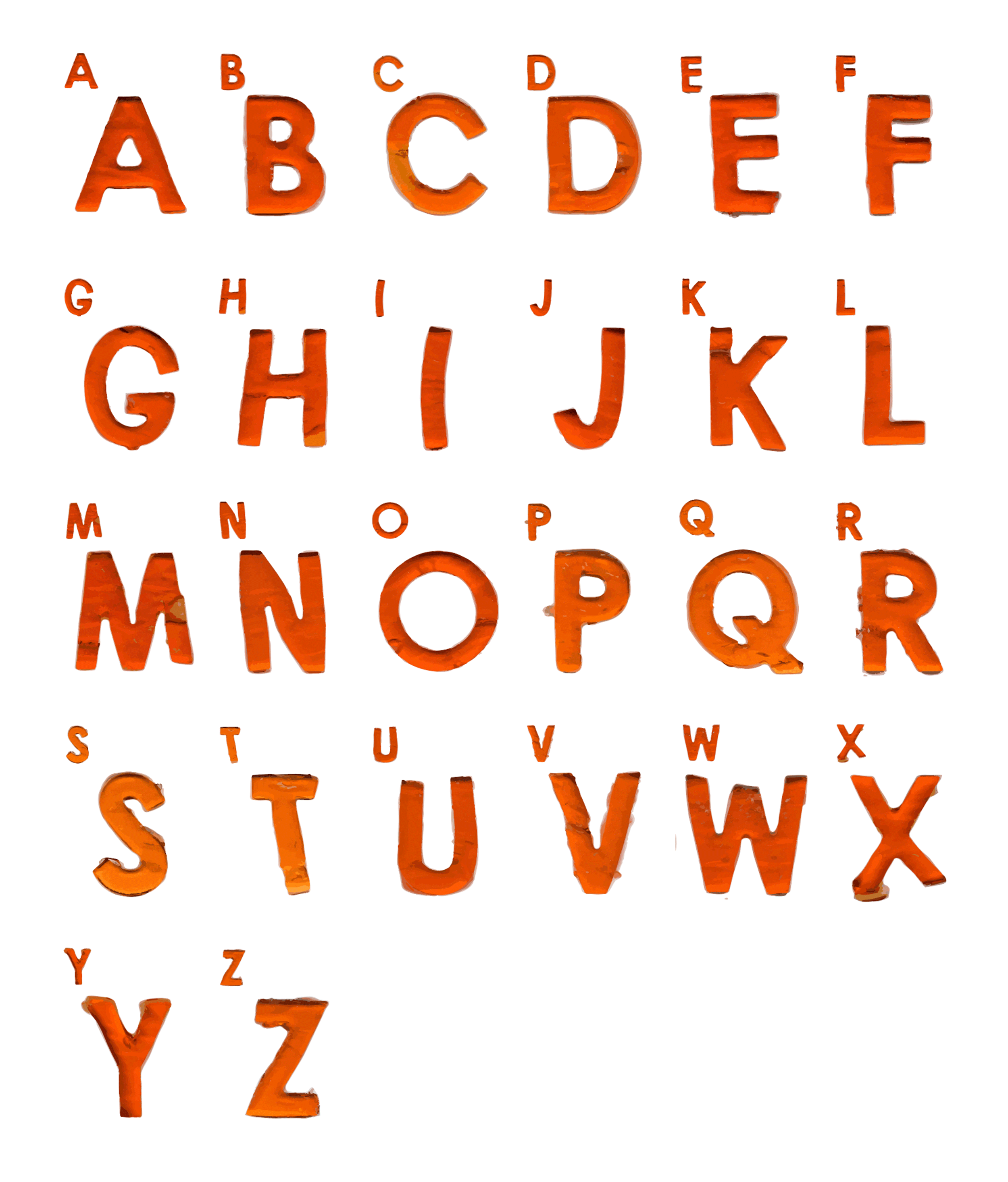
Following a YouTube crash-course on the different degrees of gelatin, the correct materials were acquired and a new batch was made. This time the letters became dense and firm at room temperature. At this point they were tough enough to hold their shape out of the mold and onto my scanner bed.
Once scanned, cropped, and edited for clarity in Photoshop, they were batched and sent to Illustrator where an extension called FontSelf made it into a working typeface.
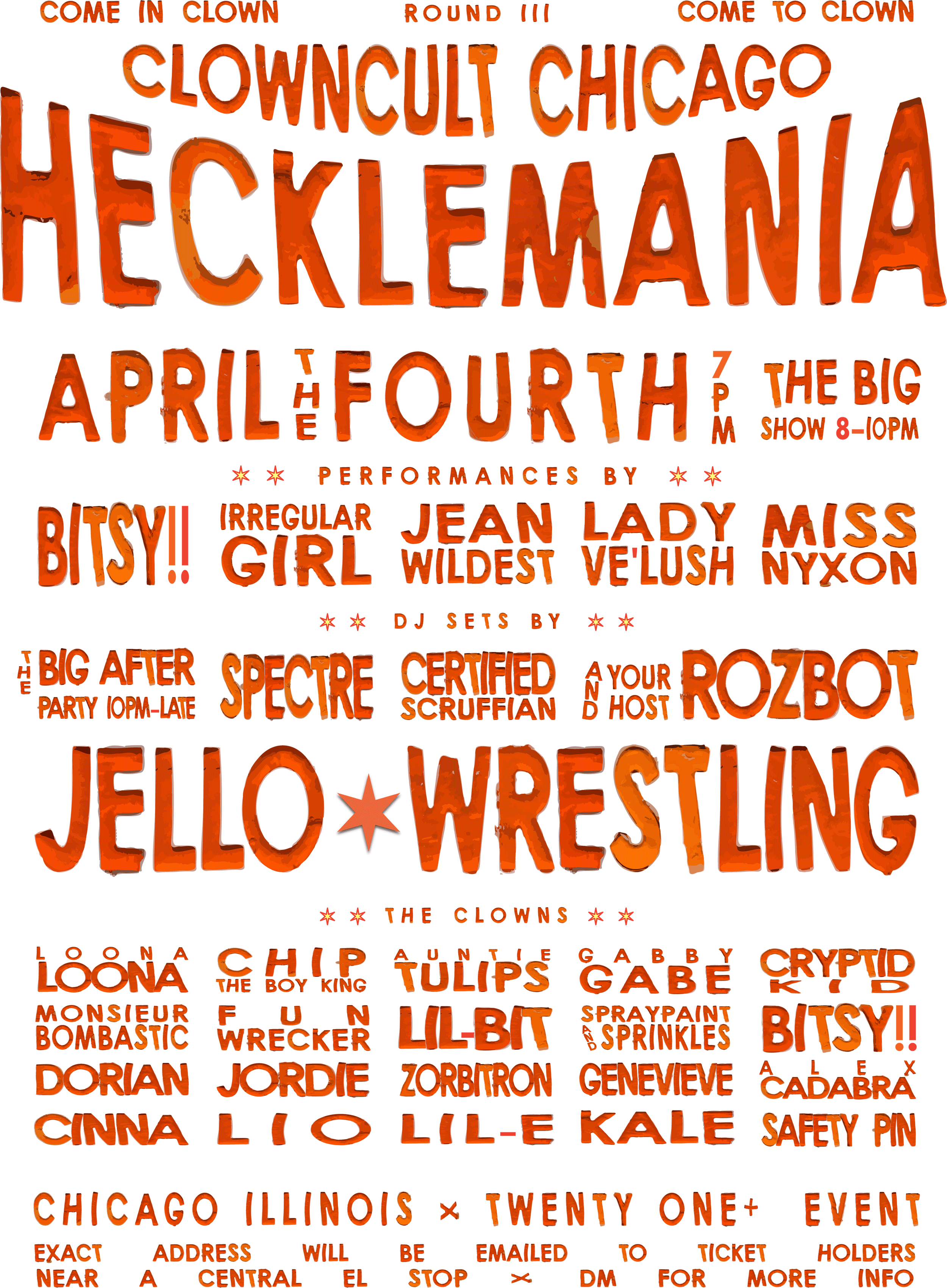
The final version of the poster (below) differs from what I’d call the “Final Draft” at the beginning of this section. While I prefer the texture and muted colors of the first version, I was able to show-off the translucent nature of the jello font for the final. It also translated better for a digital audience, whereas the first would be better-suited for print.