FEB 2025 – OCT 2026
CRYPTID KID PRINT, DIGITAL MEDIA DESIGN
CRYPTID Kid is a sideshow and burlesque artist residing in Chicago, IL. They got their start in the underground scene and have been shocking audiences from Brooklyn to Mainz with their sideshow feats.
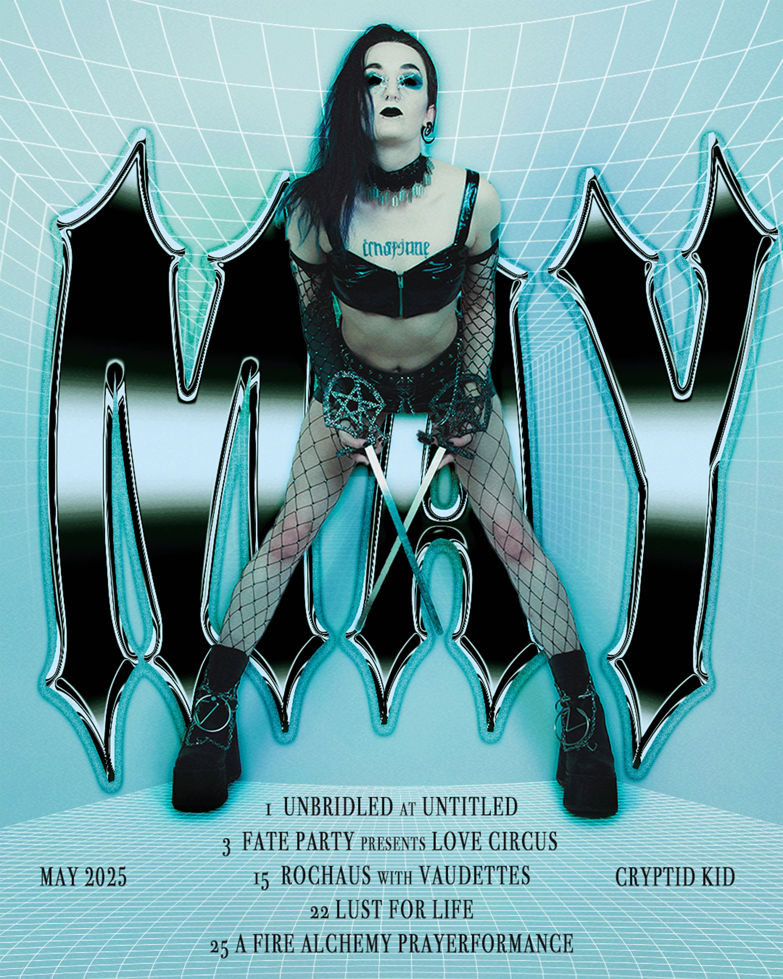
The scope of work thus far is monthly digital-flyers and print merchandise.
Cryptid performs sword swallowing, needle acts, and fire manipulation. Typically, we connect near the end of each month and they send their upcoming tour dates.
The visual language vascillates between vintage rock-posters, retro-futuristic horror, and digital psychedelia.
Concept and layout bubble-up organically. They’ve supplied a cloud-based folder of promotional shots approved for marketing, and in some cases these images are screenshots or taken by audience members in sub-optimal lighting; this is the biggest challenge with the best rewards.
These are not always photographs that lend themselves to reproduction—either because their quality is poor or they appear candid and distracting. A major influence on the final output is, “What kind of edits can bring this photograph to an editorial level?”
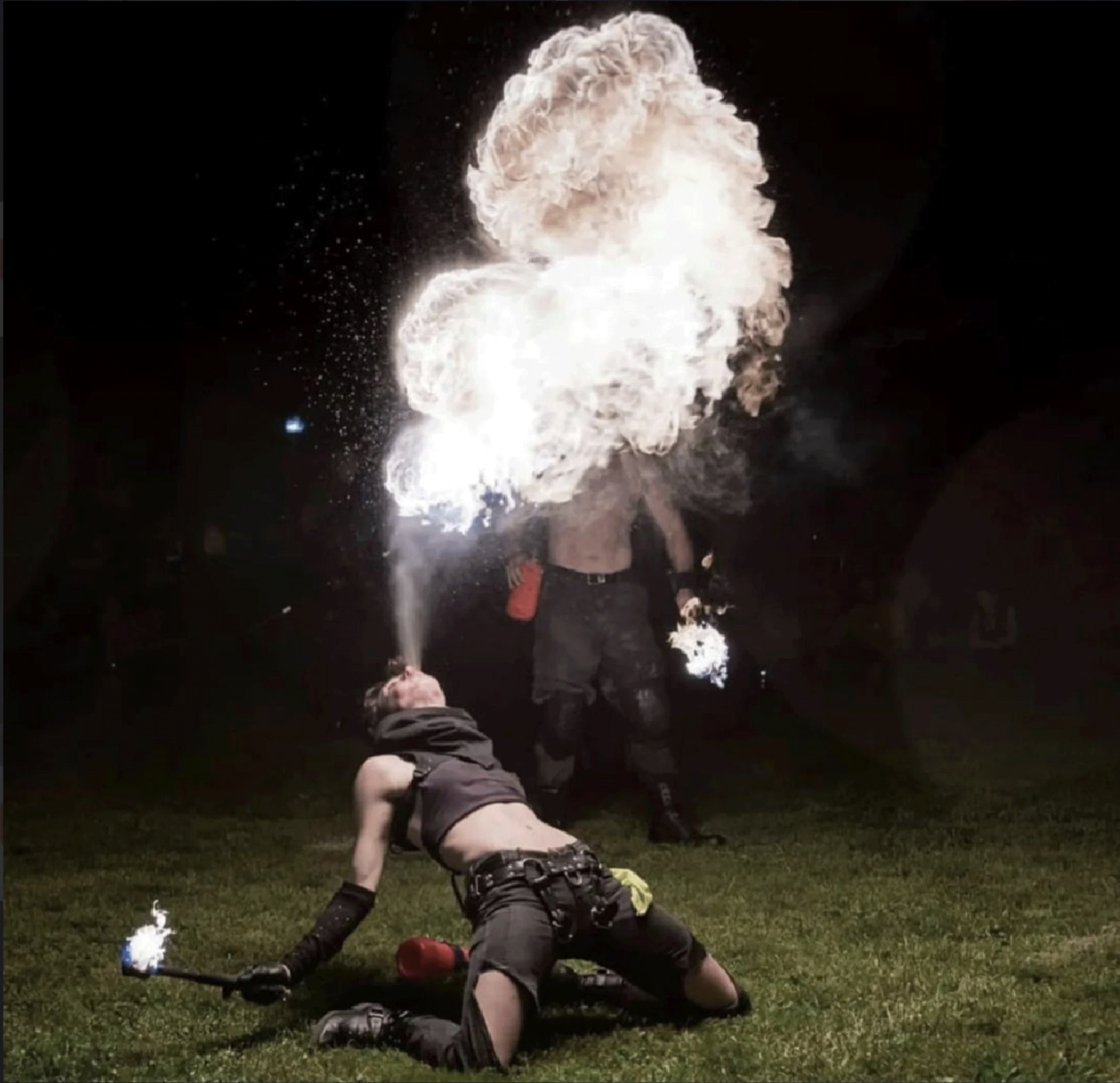
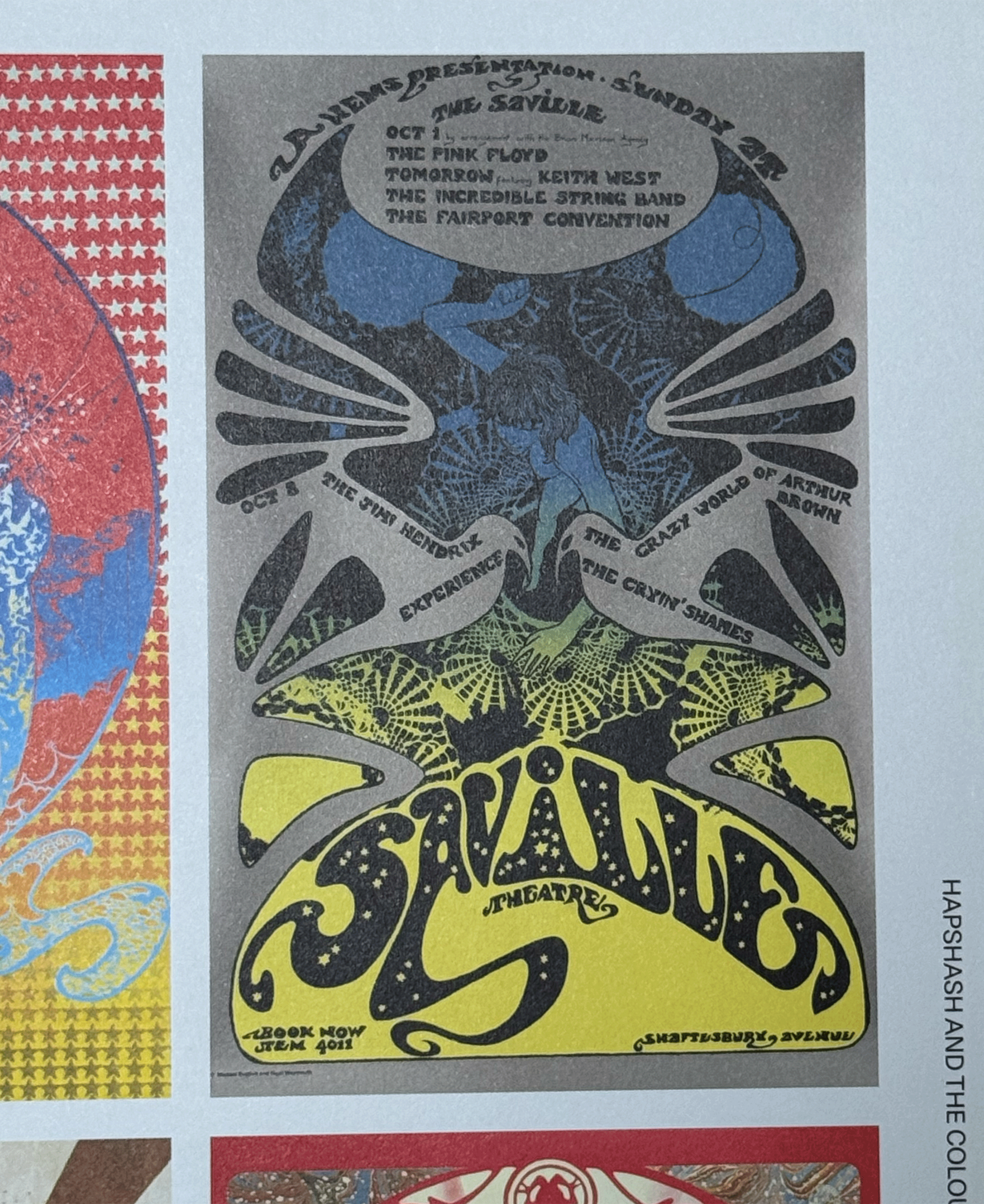
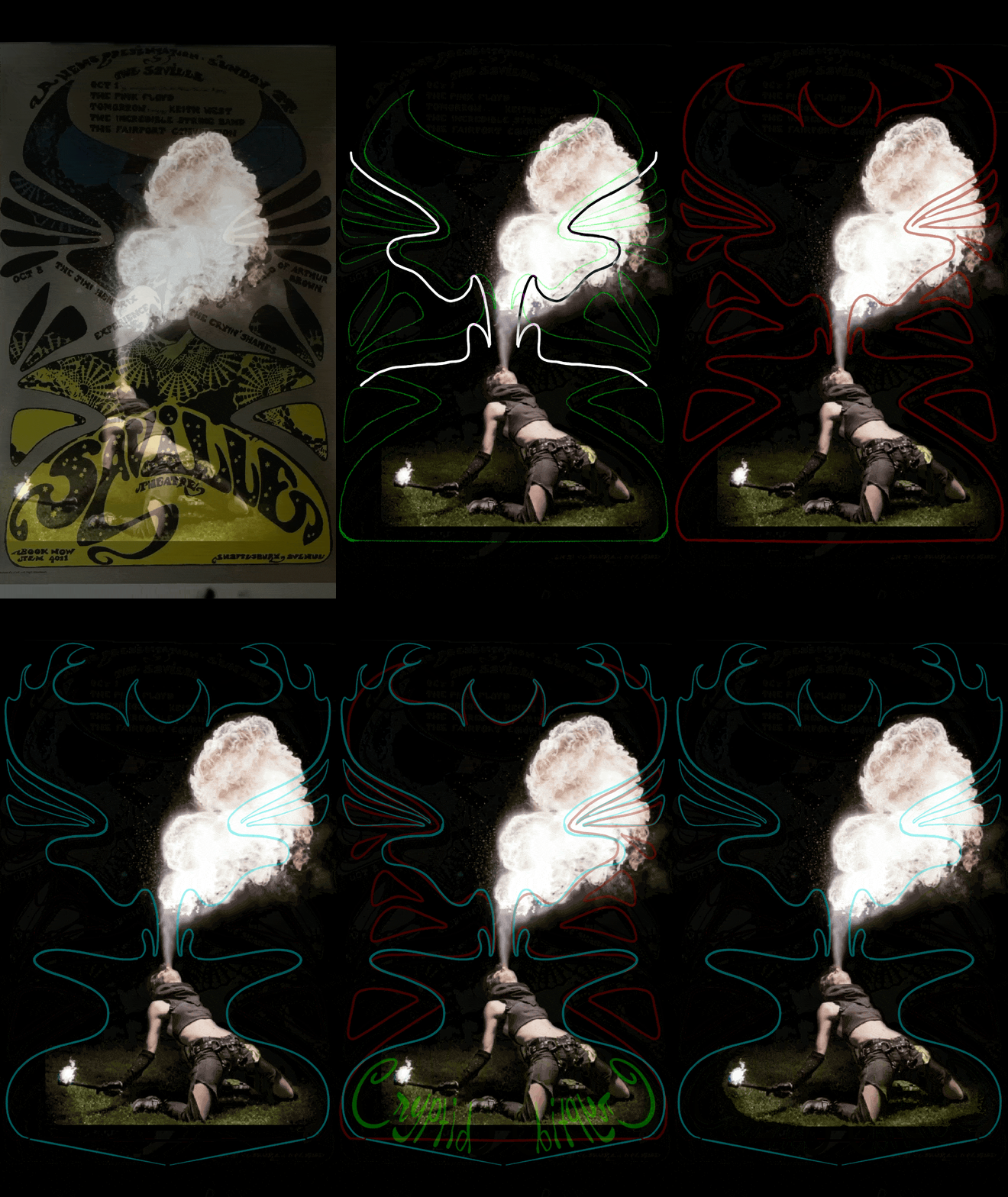
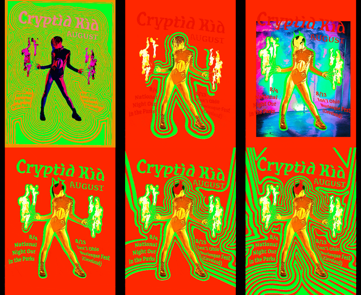
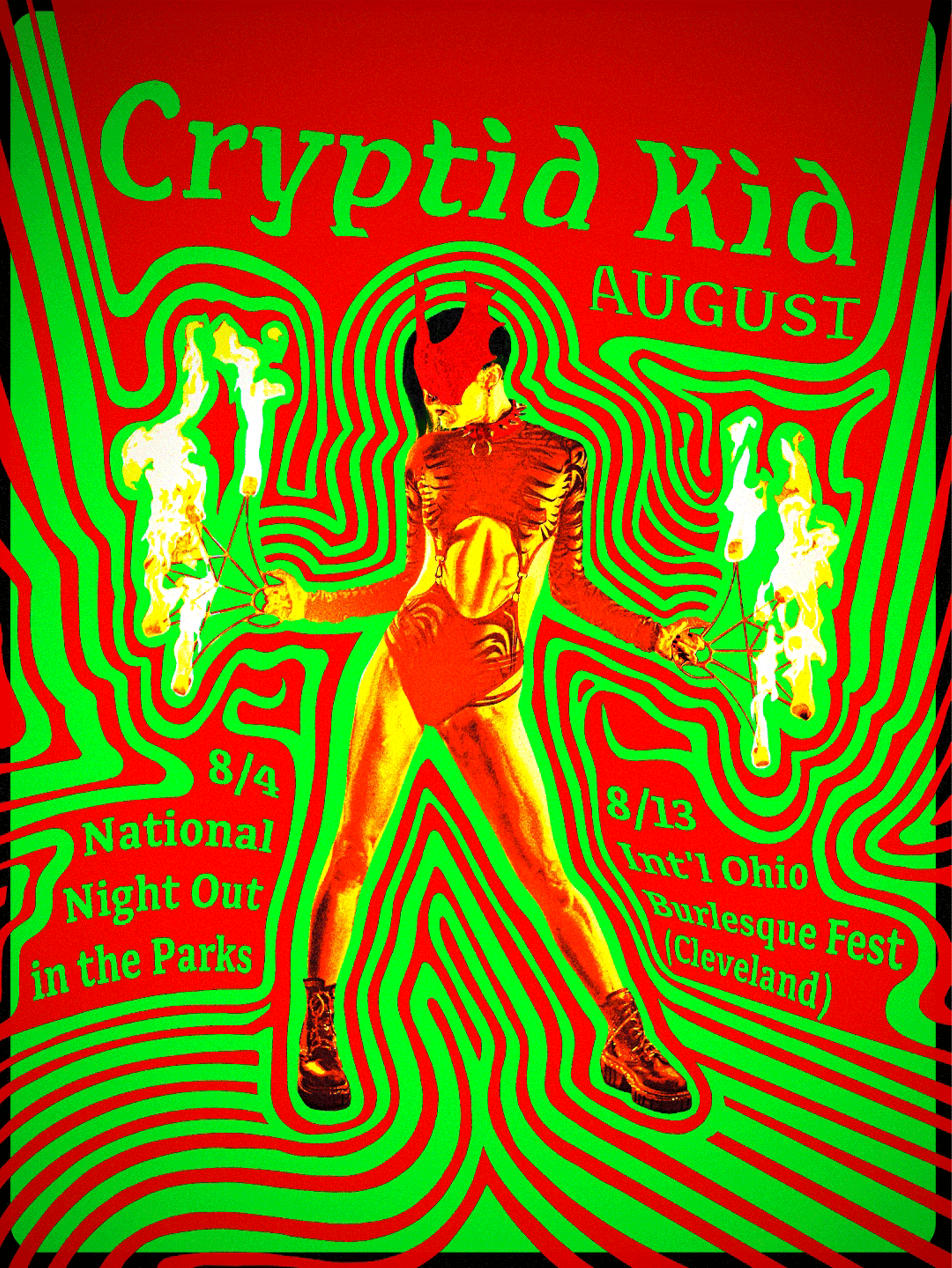
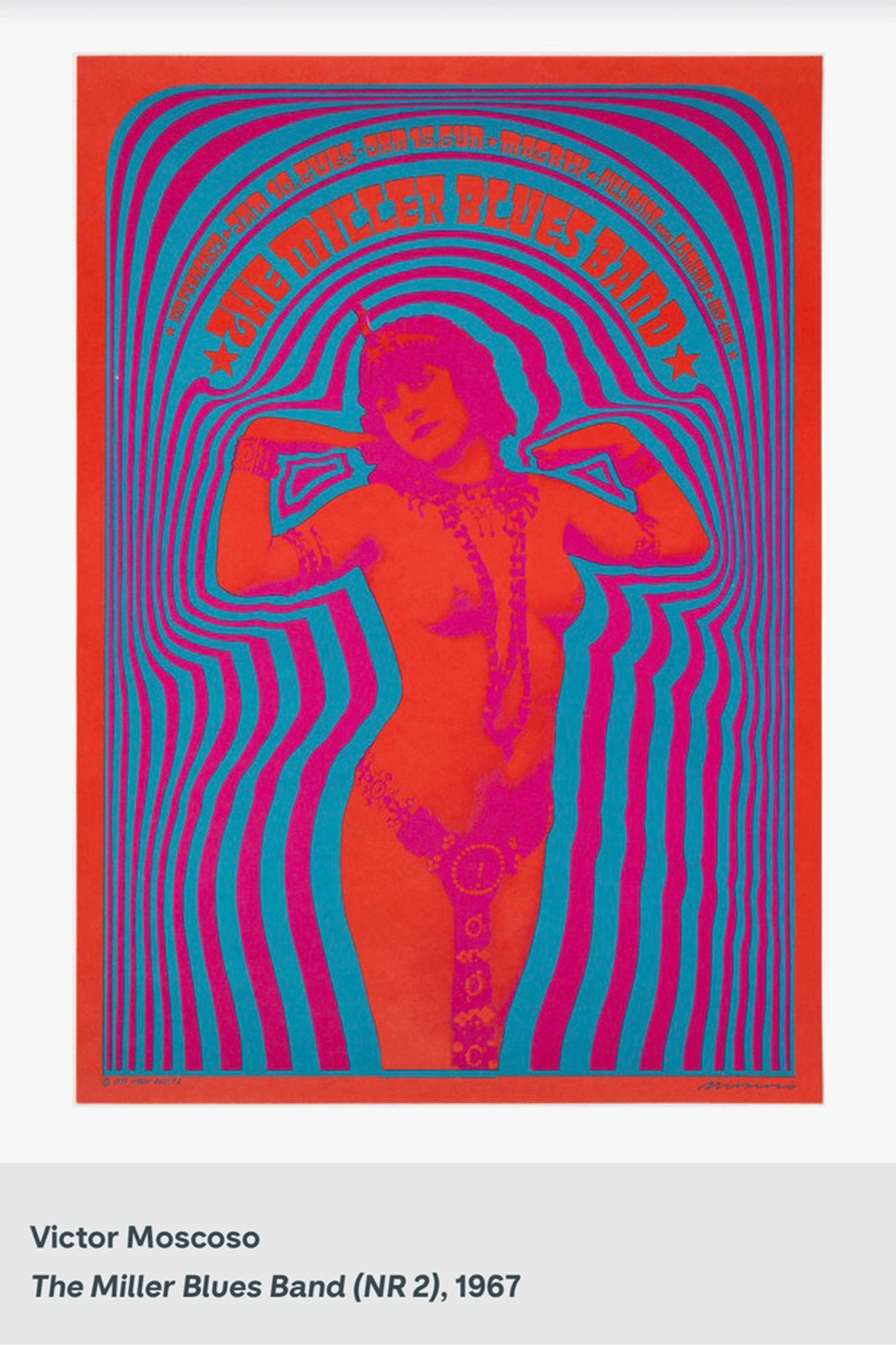
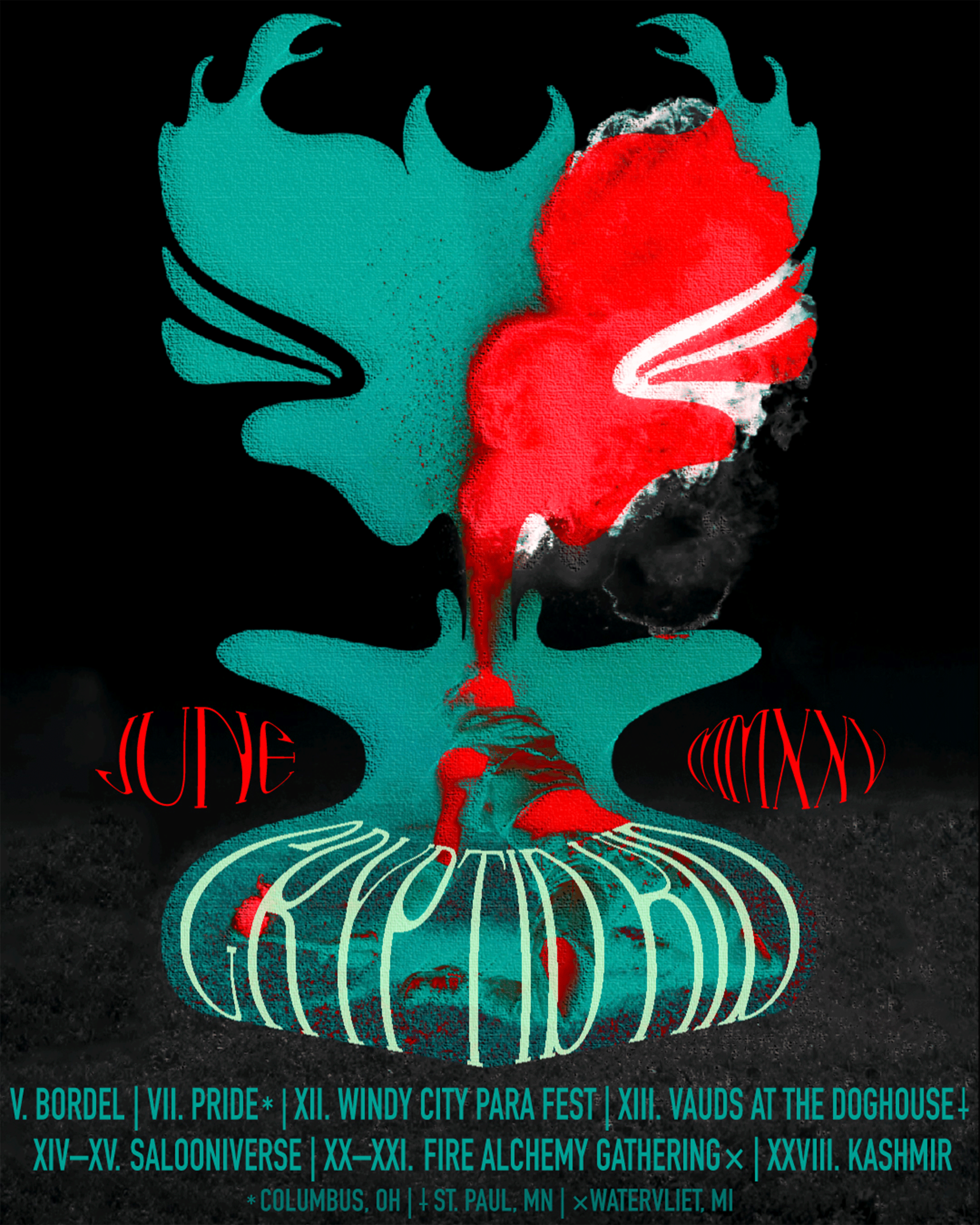
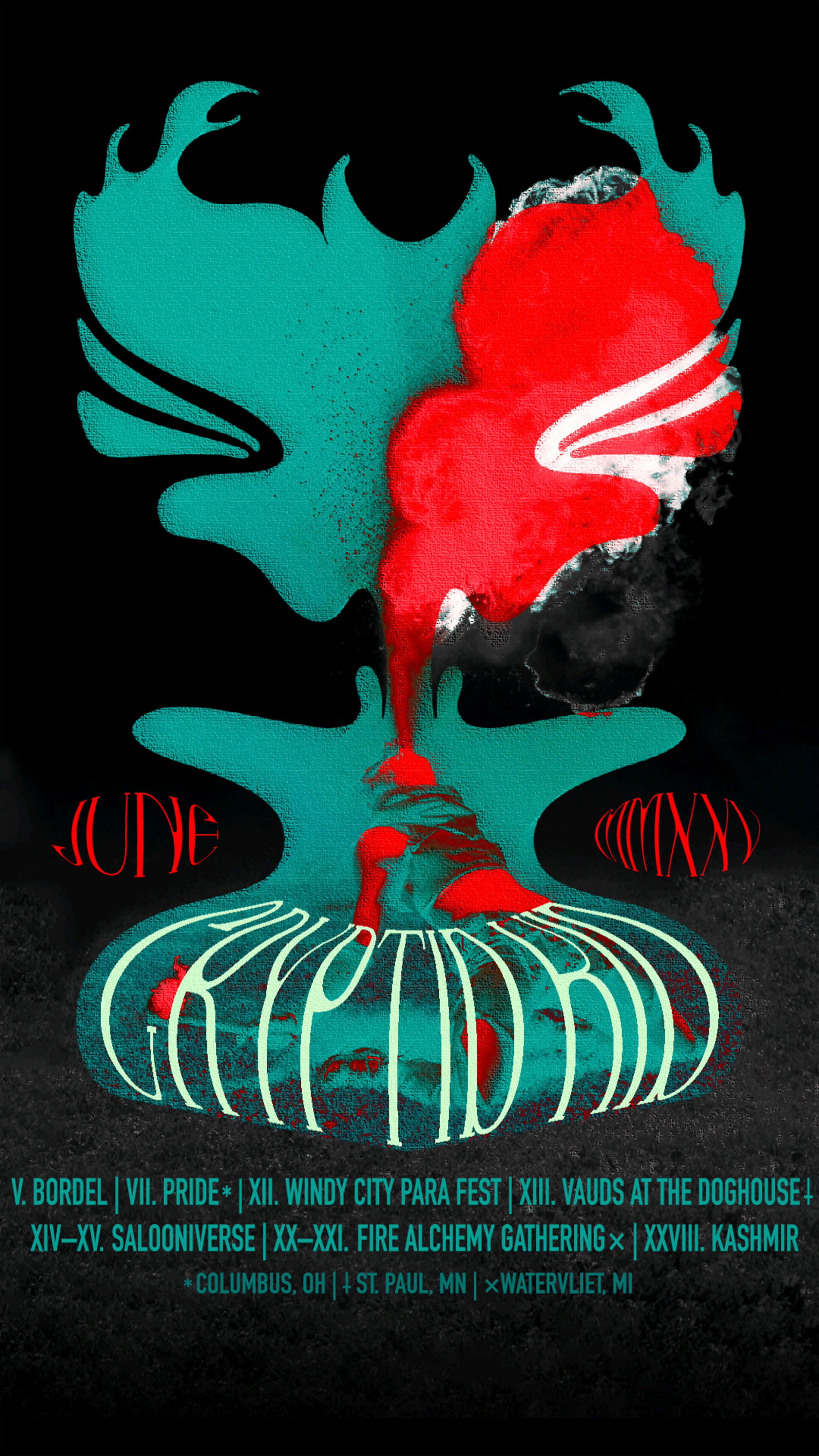
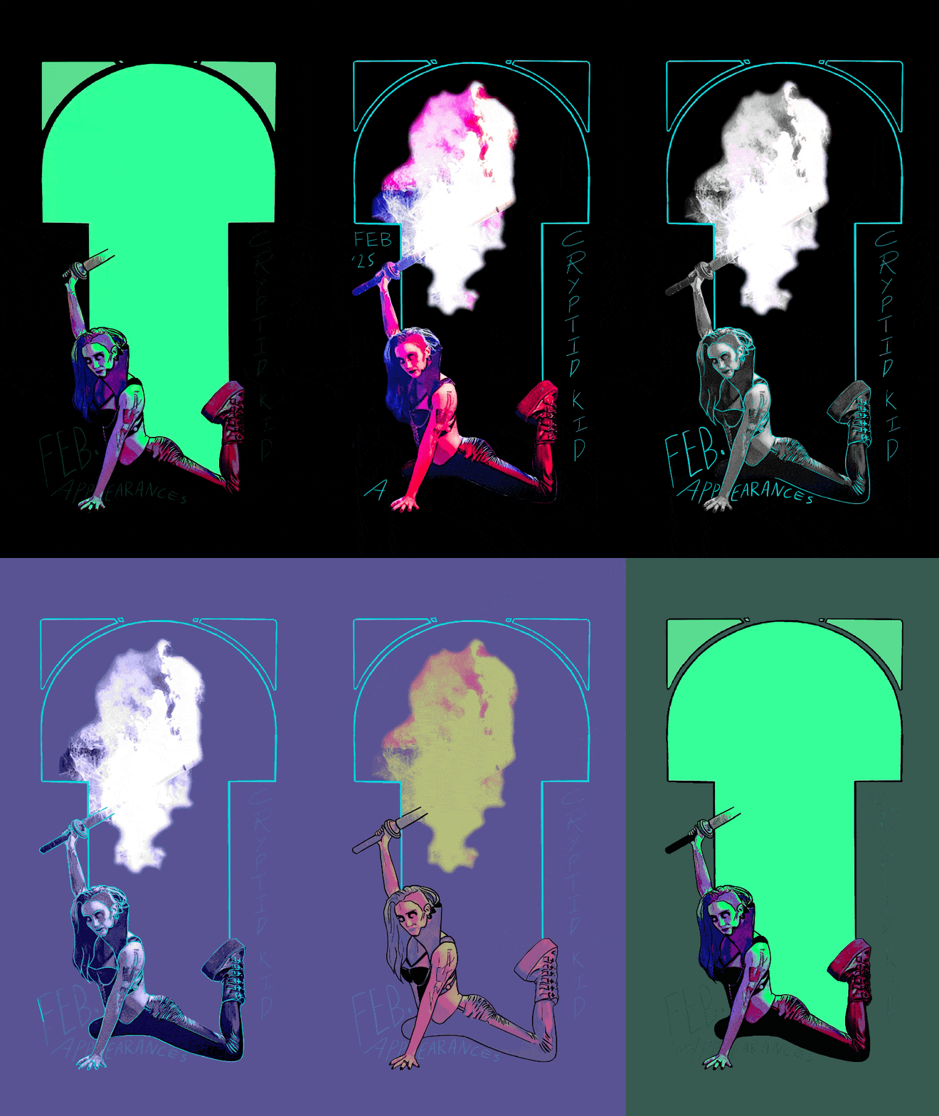
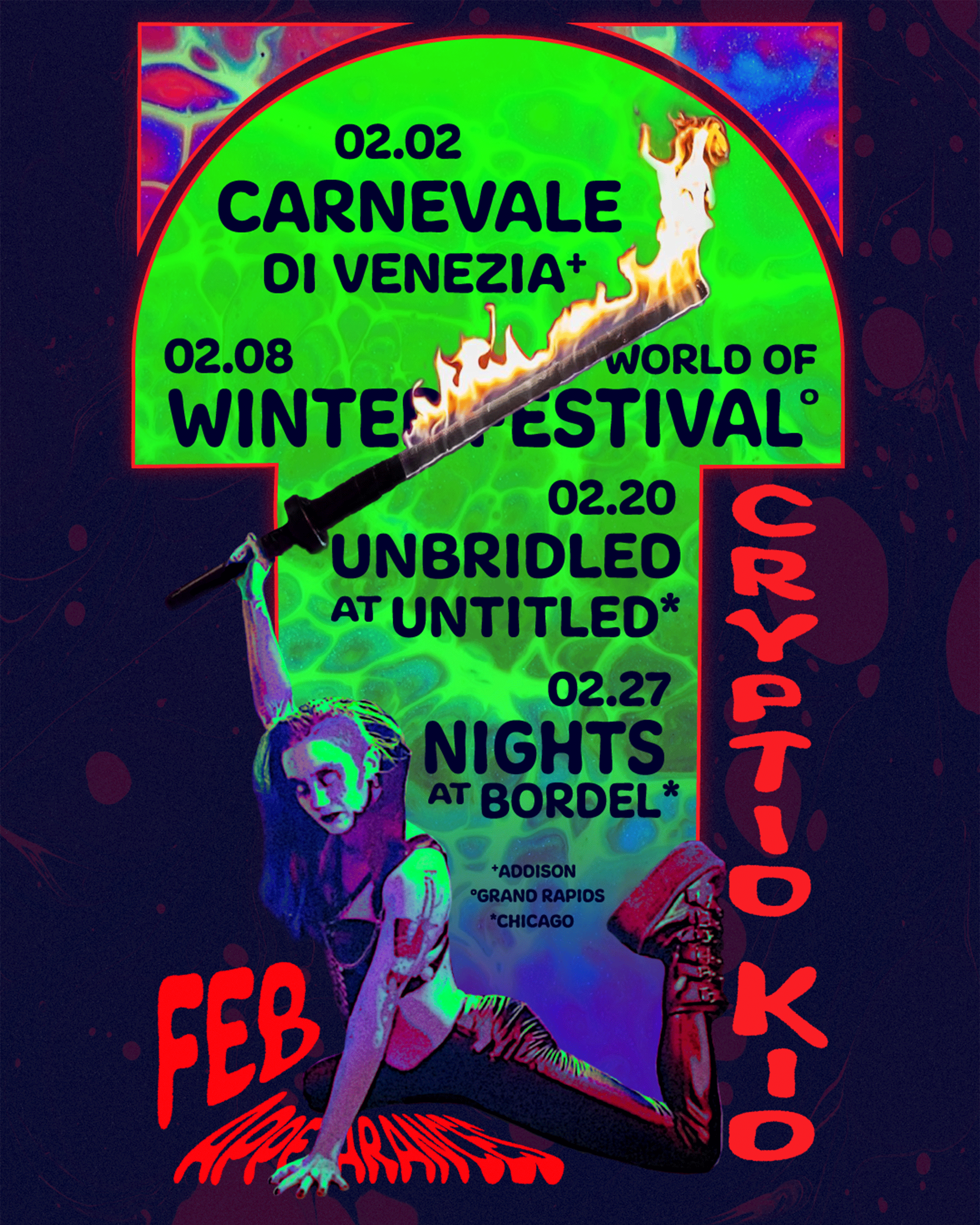
This is an example of an outstanding image with less than ideal resolution. However, with some creative editing and illustration I was able to recreate the photograph with inspiration from 60’s British collective Hapshash and the Coloured Coat, who were also very inspired by Alphonse Mucha and art nouveau.
What stood out about the photo compostition was how Cryptid had created (breathed?) a castmate into that fireball. So, utilizing the hooked frame from the Hapshash style, the fireball was given an elegantly horned, demonic illustration. Like a volcano, Cryptid’s body hinges forth from the cagelike text of their own name.
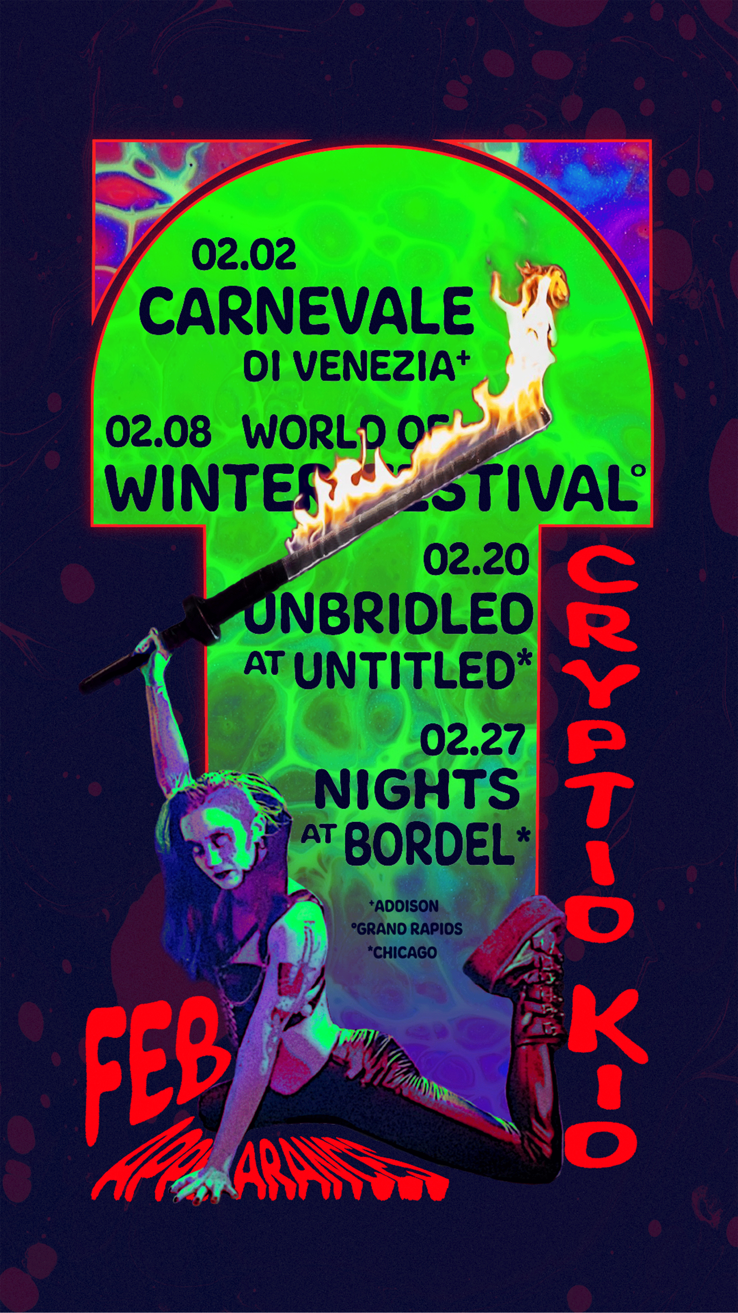
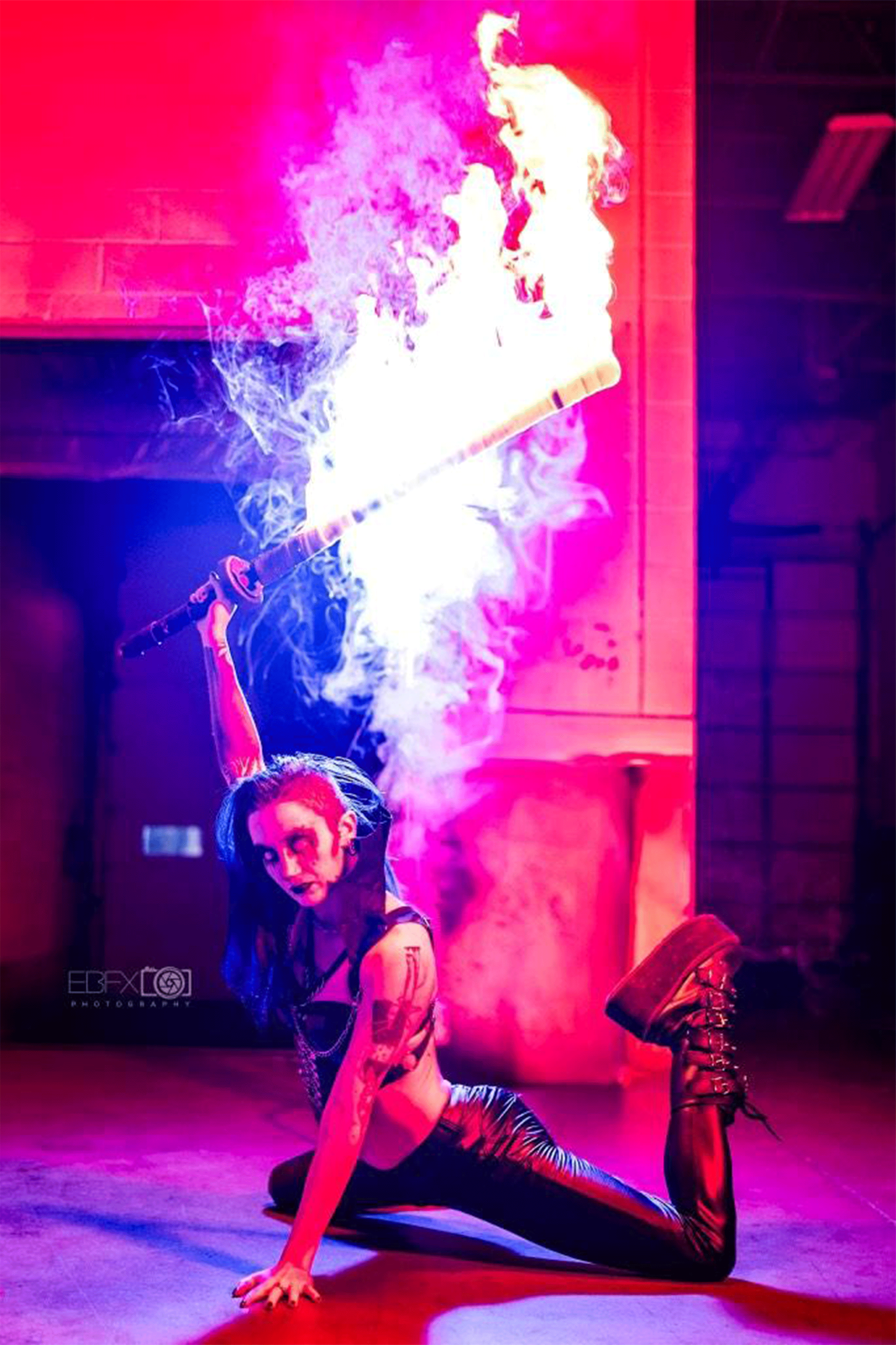
This was another instance where illustration was used to edit what photography left out. After eliminating the background, the sword was stitched with another, high-res photograph of the flames. Tiny details around their face, clothing, and even the bicep tattoo were repainted and the entire image was recolored.
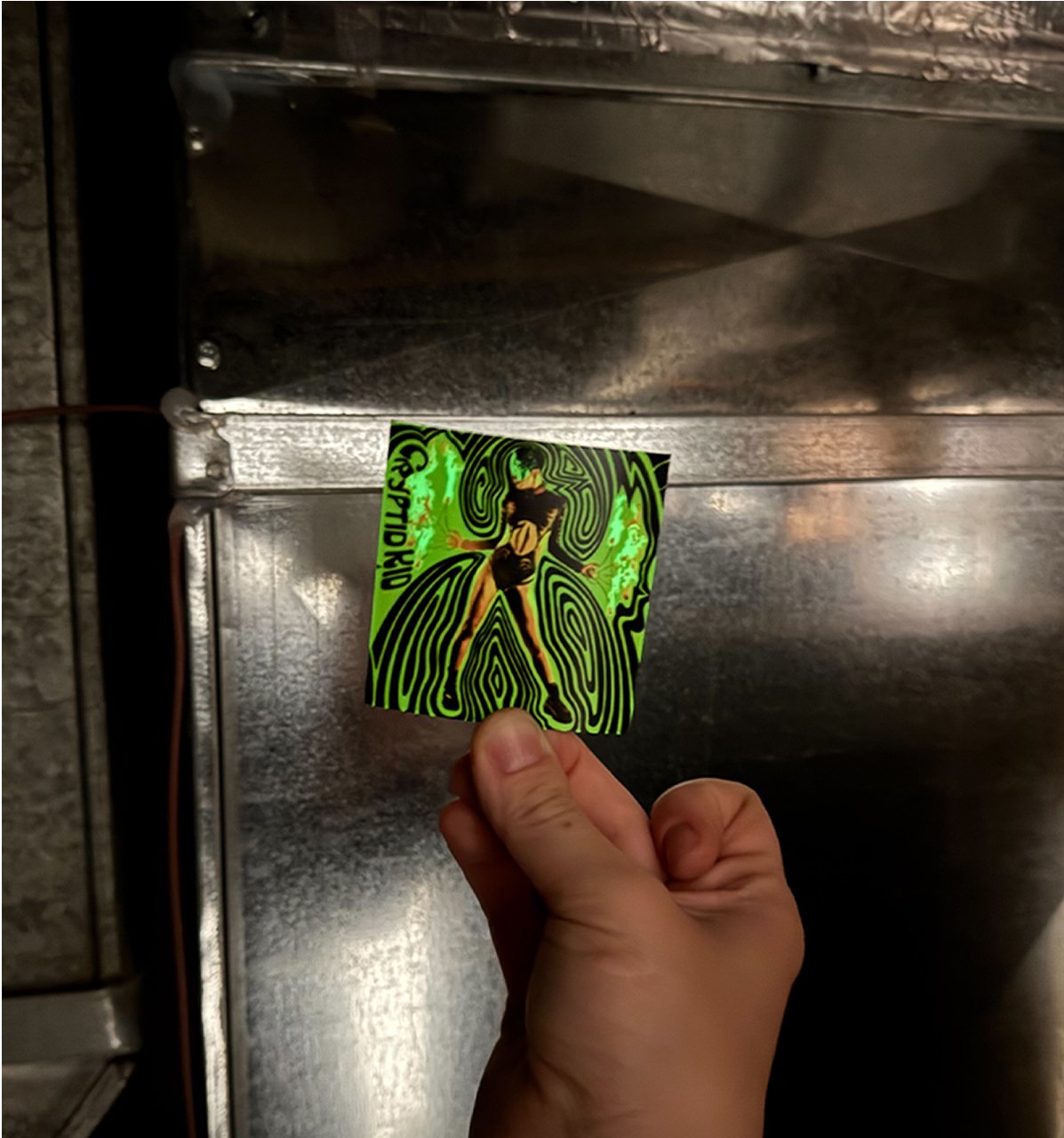
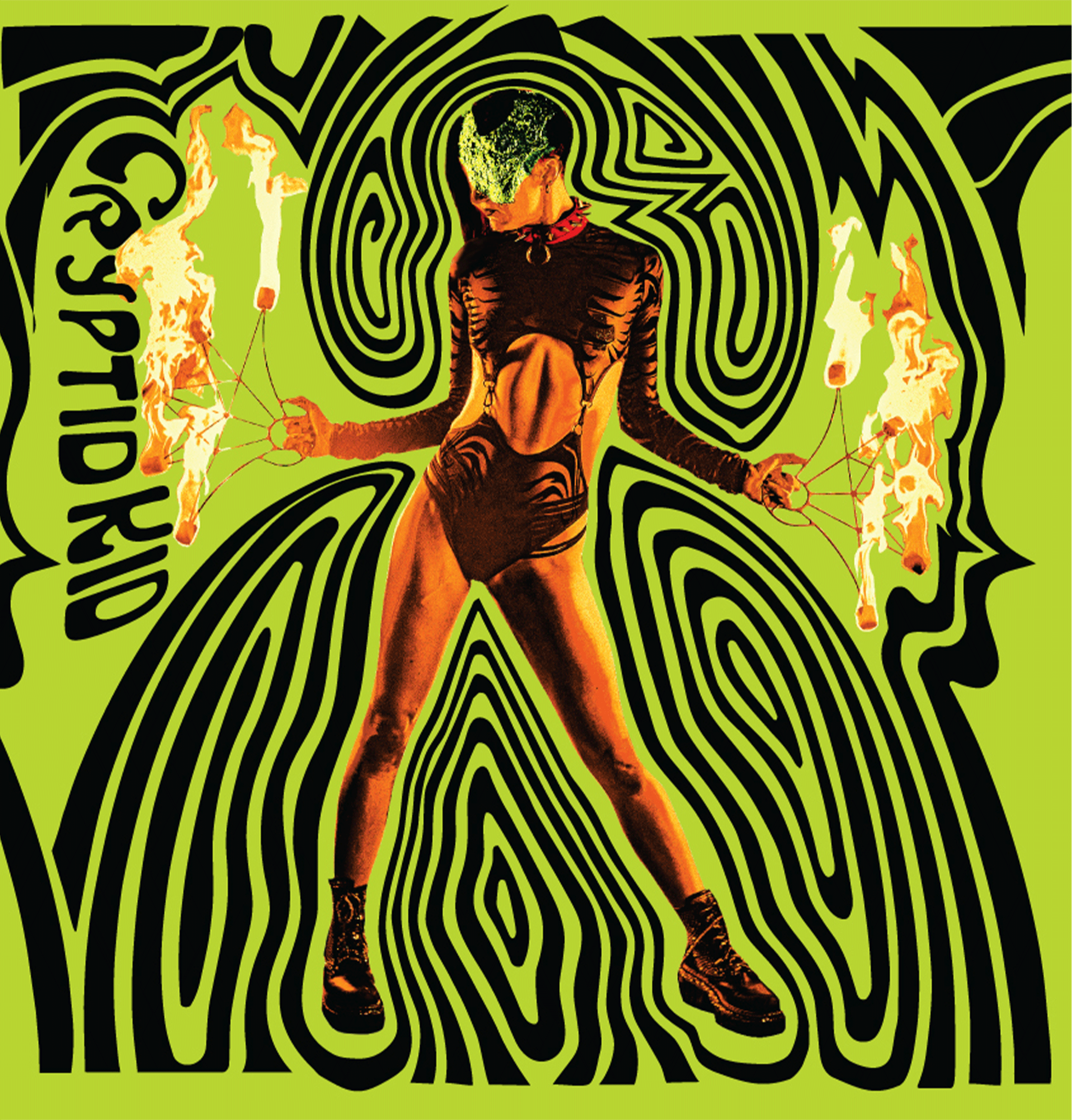
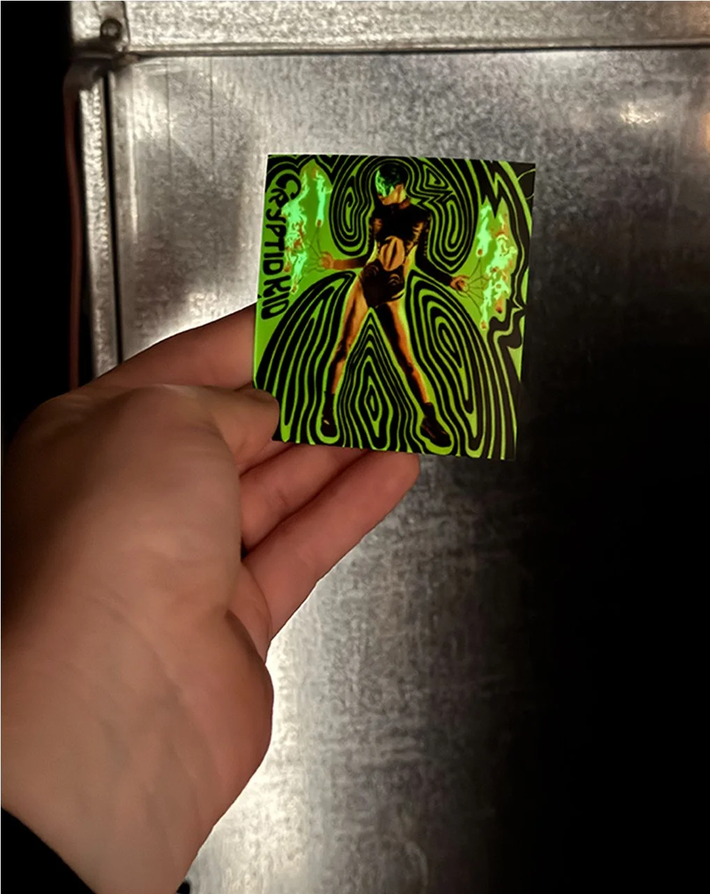
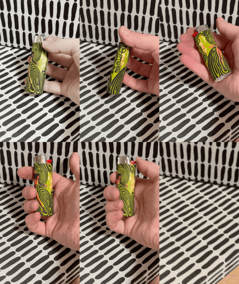
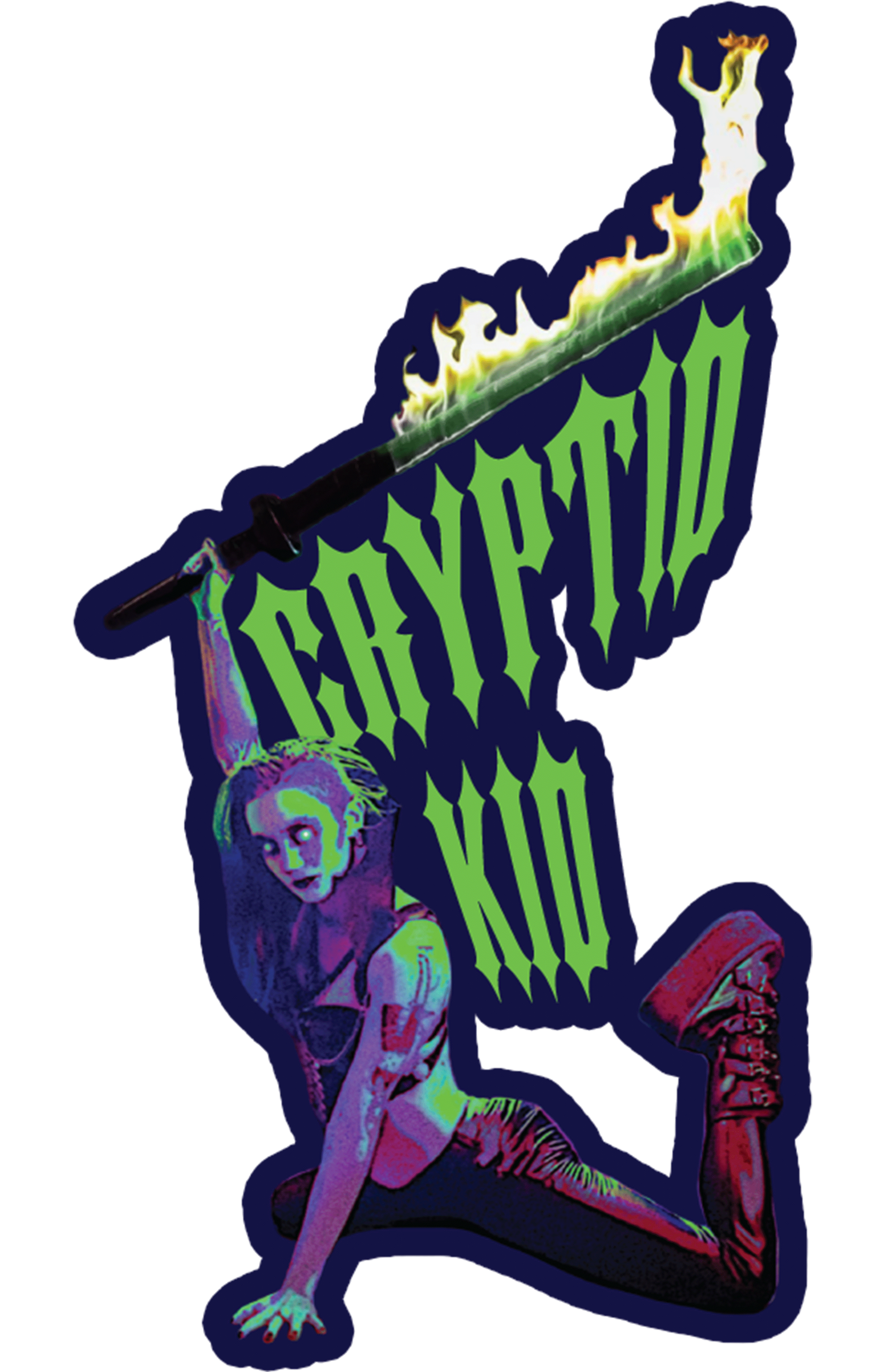
When Cryptid reached-out wanting custom stickers, this design was the first one mentioned. The non-pink palette aligned best with their personal aesthetic—and it highlighted one of their neatest props.
It was reworked with a sharp, Gothic typeface that screams “Cryptid,” in a hue evoking monsters-of-the-deep. Then, a rubber stamp with their credentials could be used to add their “business card” to the papered backside.

Unsolicited book recommendation:
‘Rock Graphic Originals: Revolutions in Sonic Art From Plate to Print ‘55–’88’ by Peter Golding with Barry Miles; wonderful catalog of posters and endless inspiration. Color-shy? Not anymore…

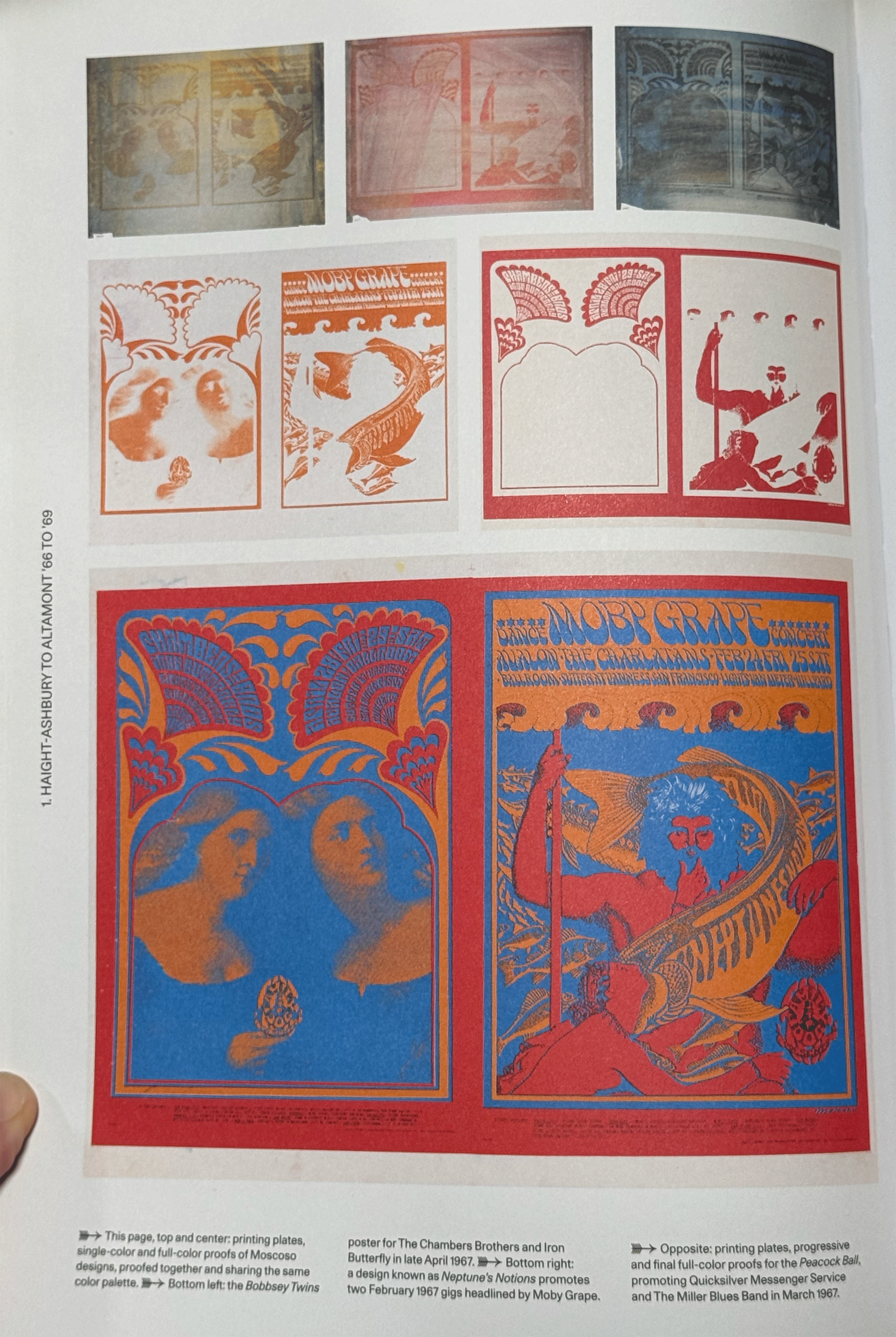
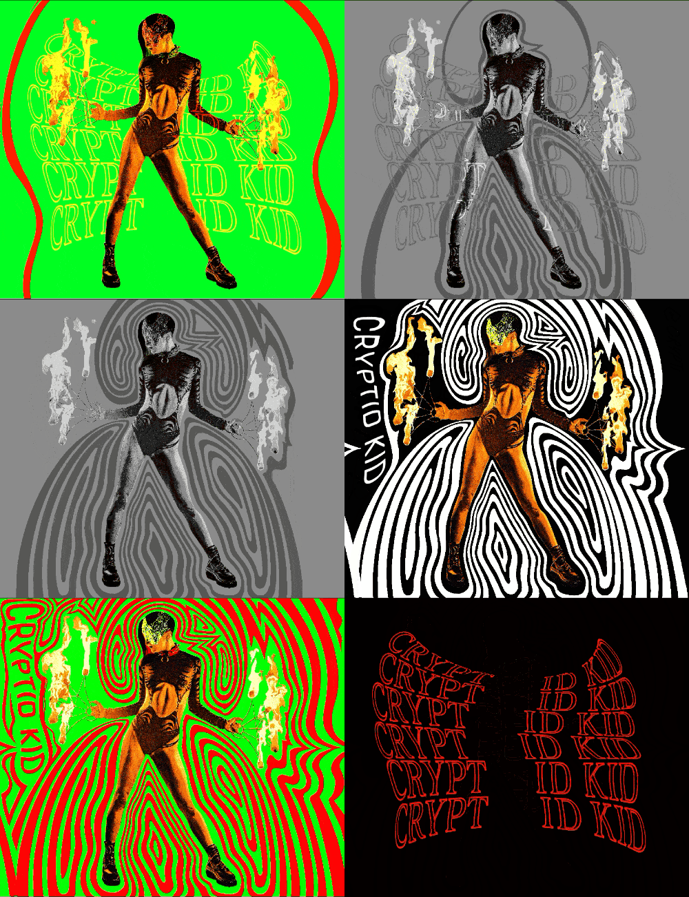
The appeal of the book is how clearly a line is drawn from the linework and illustration of the nineteen-twenties to psychedelic art in the sixties and seventies. For Cryptid, this felt otherworldly and exciting, without falling into the trap of only dark and moody imagery (which naturally is associated with their style of performance).
FINAL
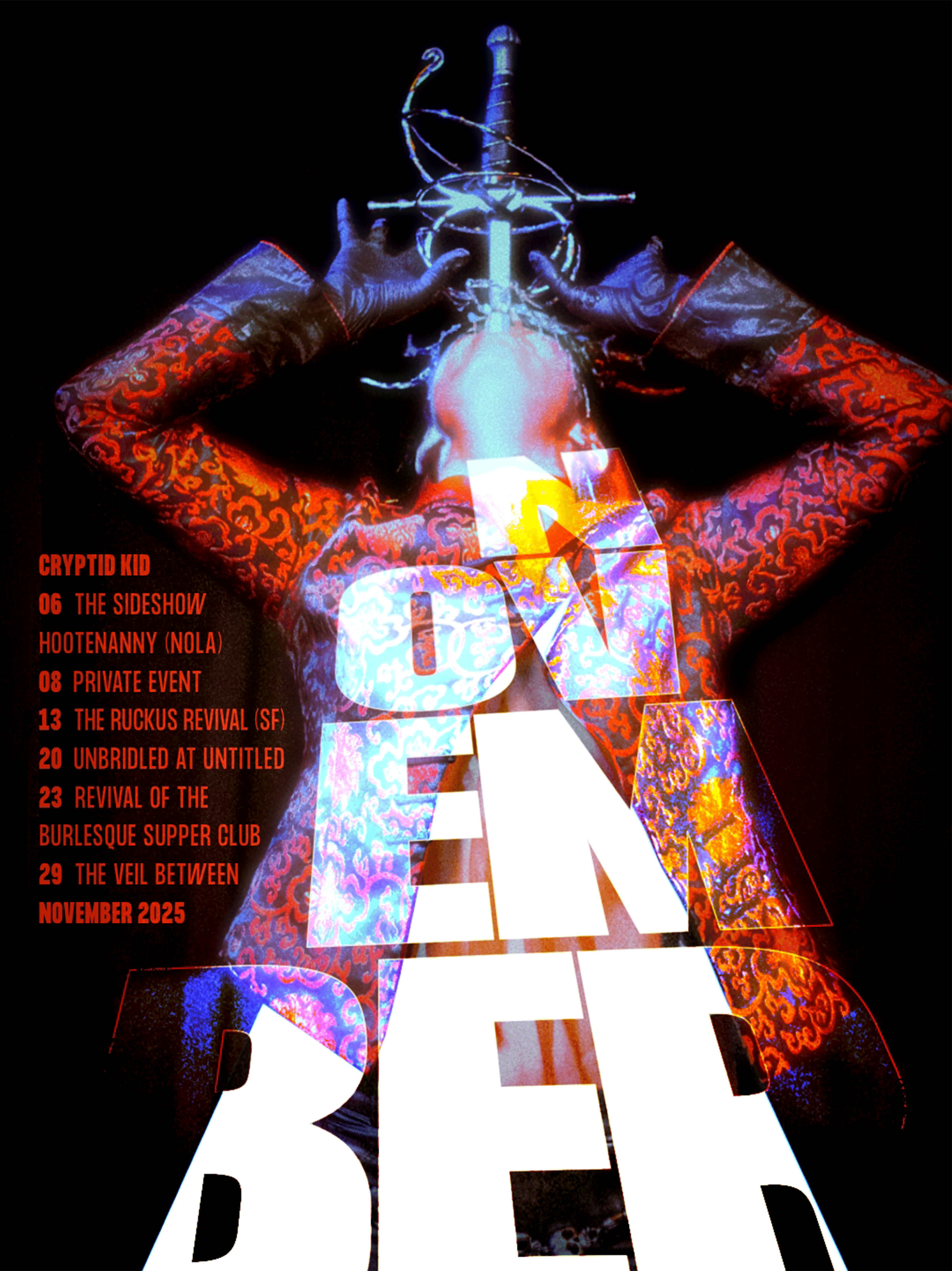
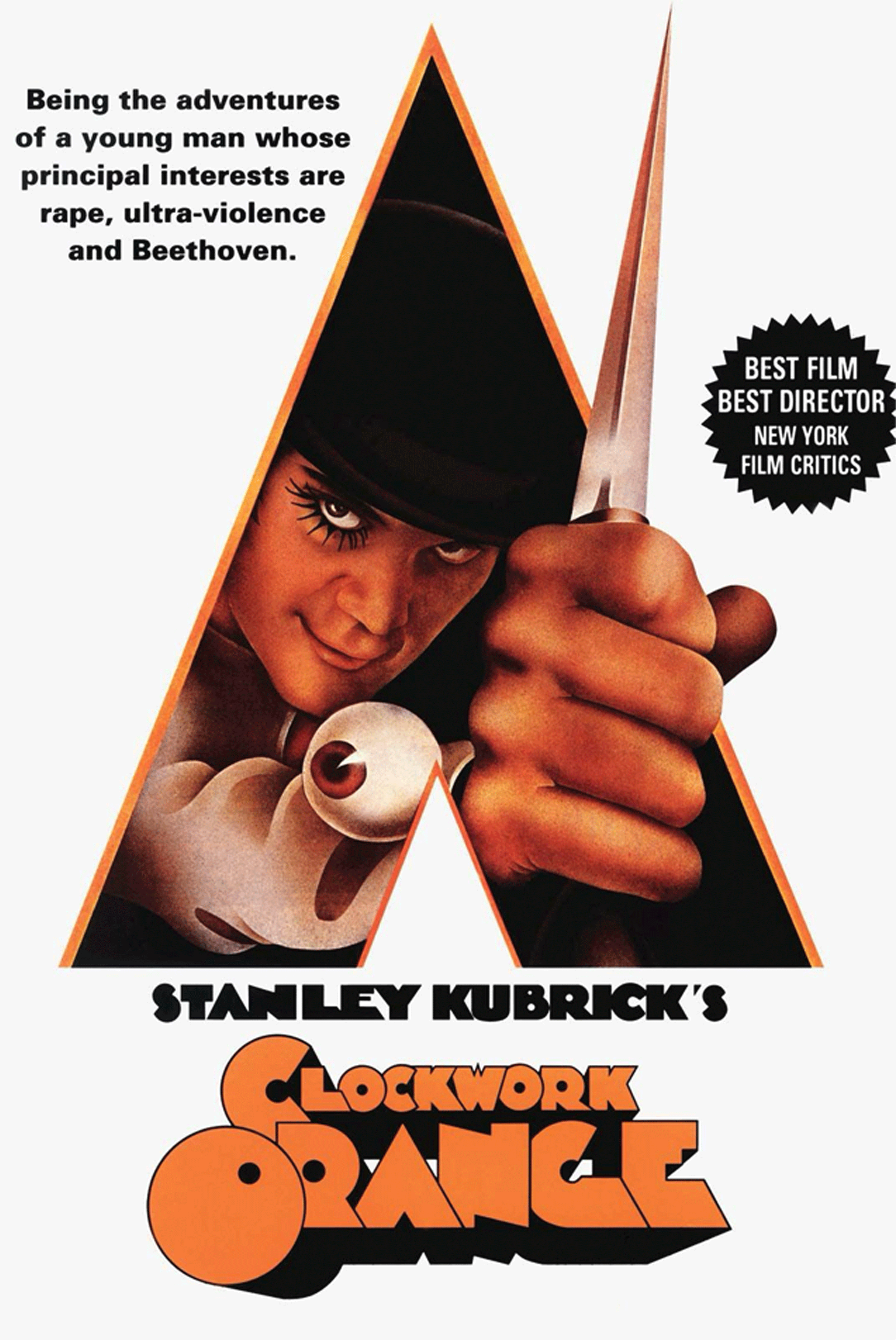
Experimentation with retro film and television graphics. This was an audience photo, and needed some manipulating to coax-out all the levels. At first glance, there was also a strong desire to utilize the triangle-shaped cutout created by their jacket. This strong shape and the sharp upward angle struck me as Kubrickian.
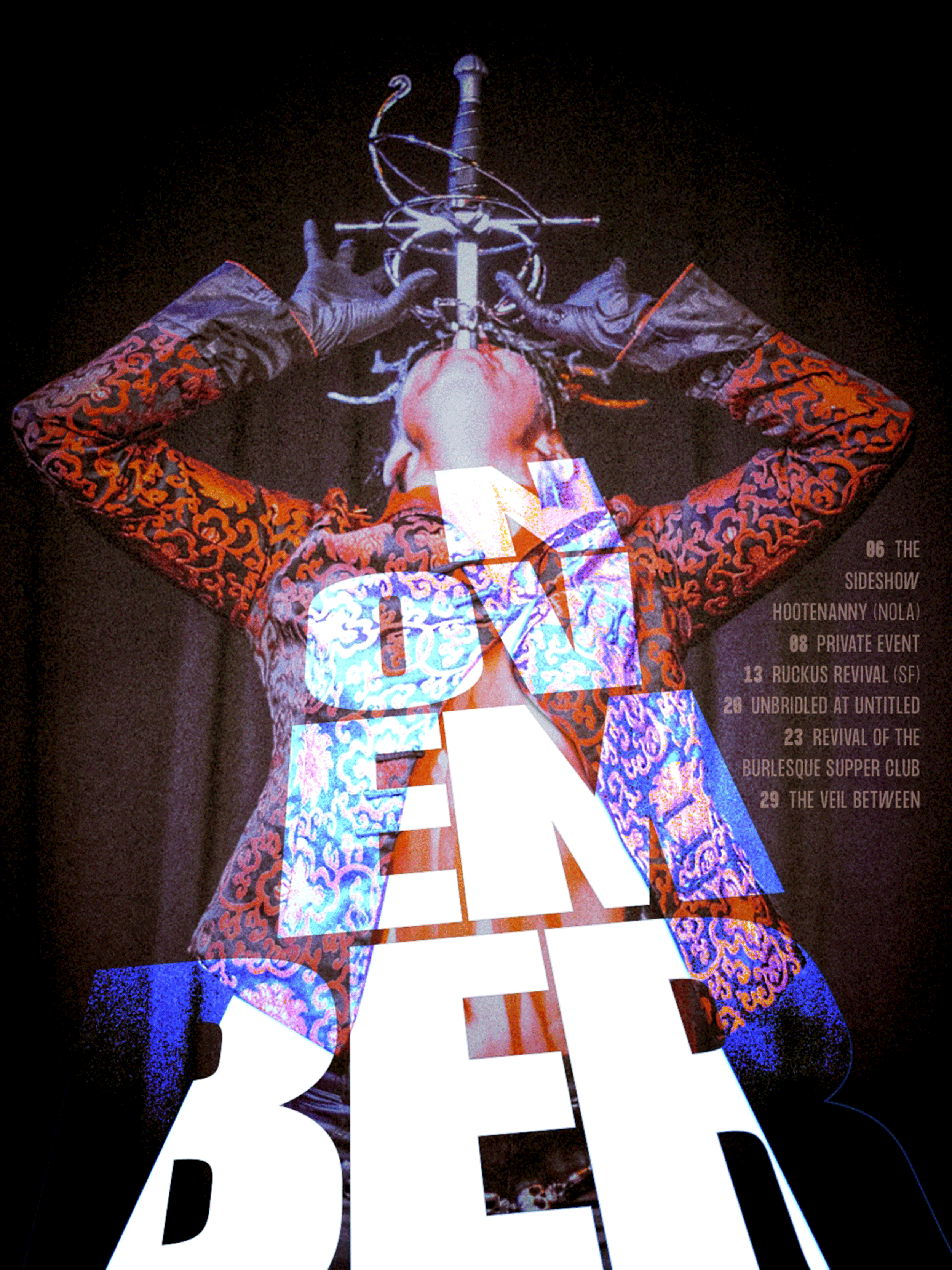
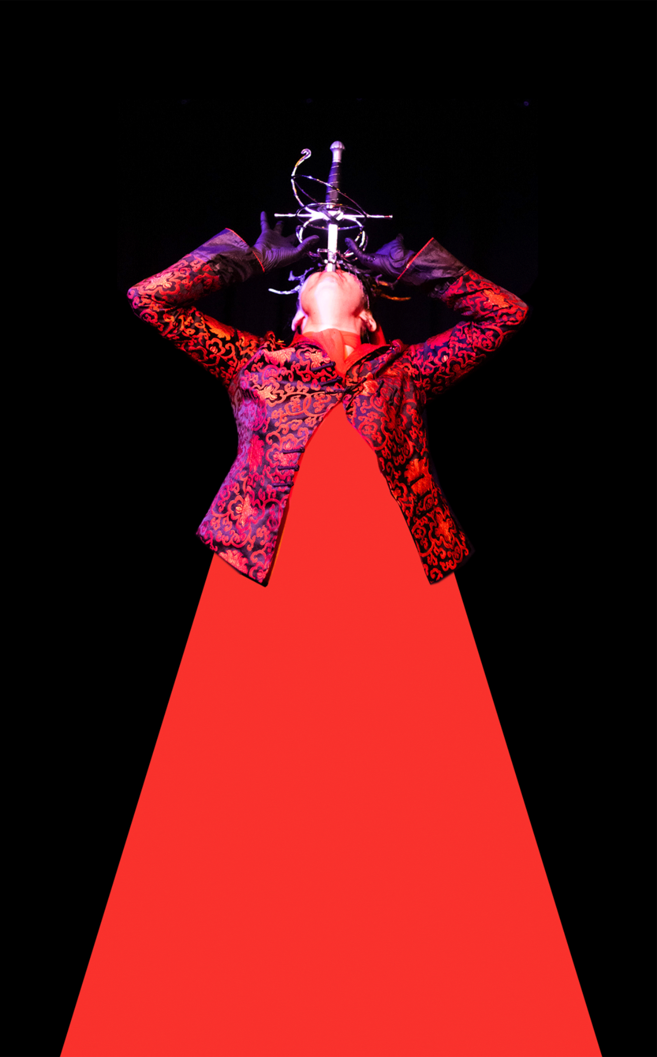
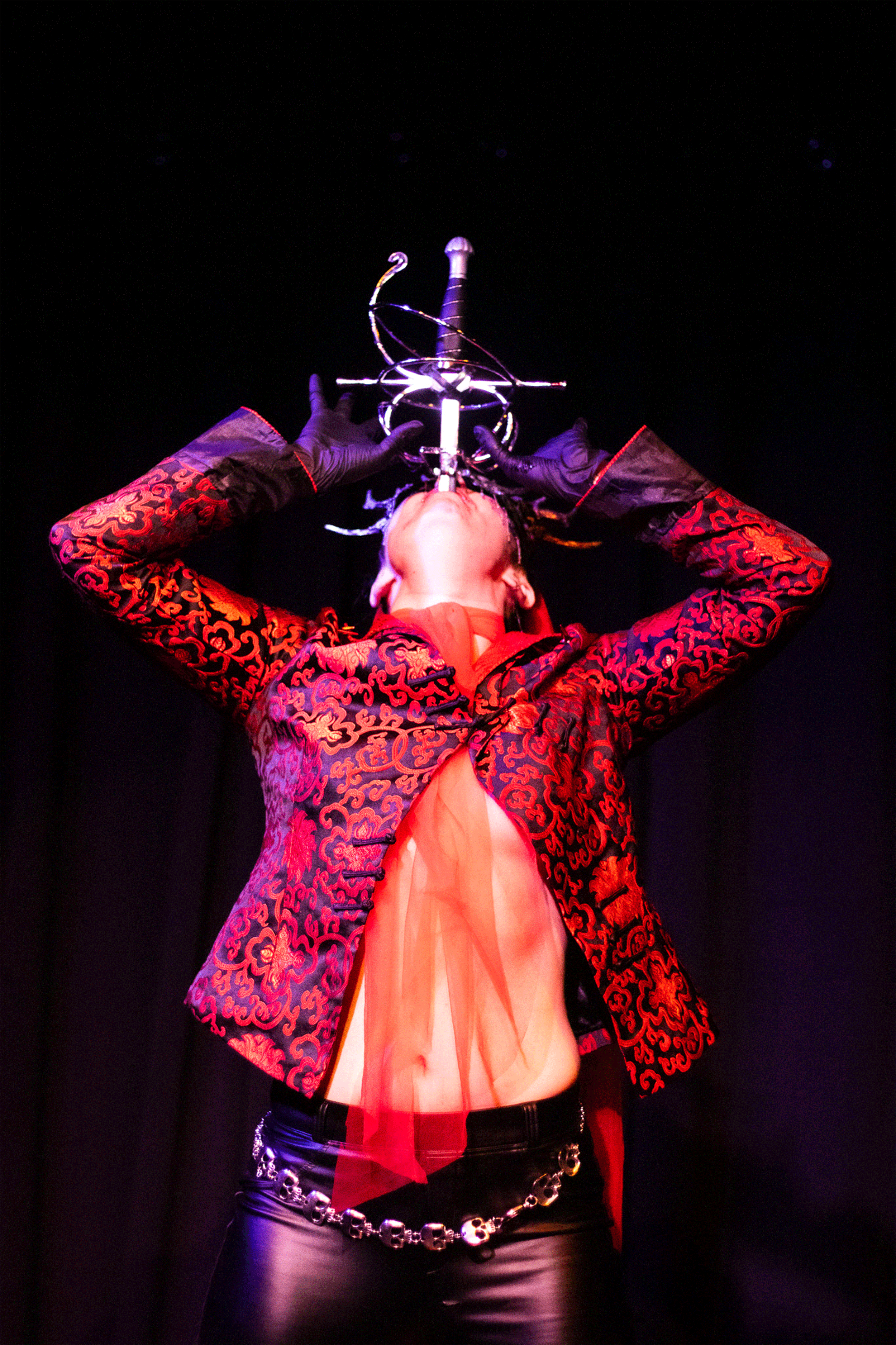
Two instances, with two takes on color-grading and typography. Ultimately, the final image was chosen for the ghostly blue glow on their skin and the bright pop of red-orange. Use of complementary colors became another trend in their graphics.
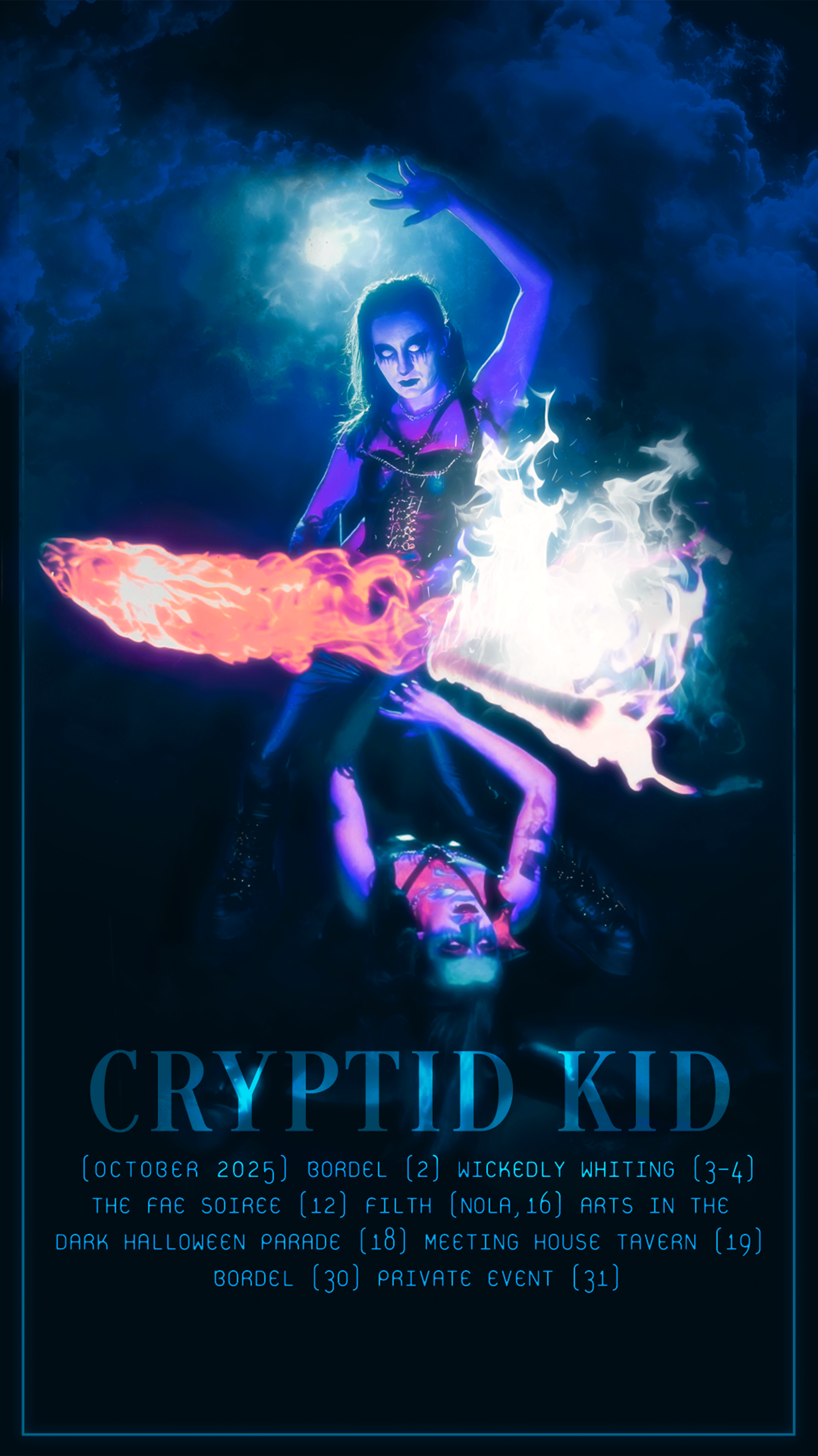
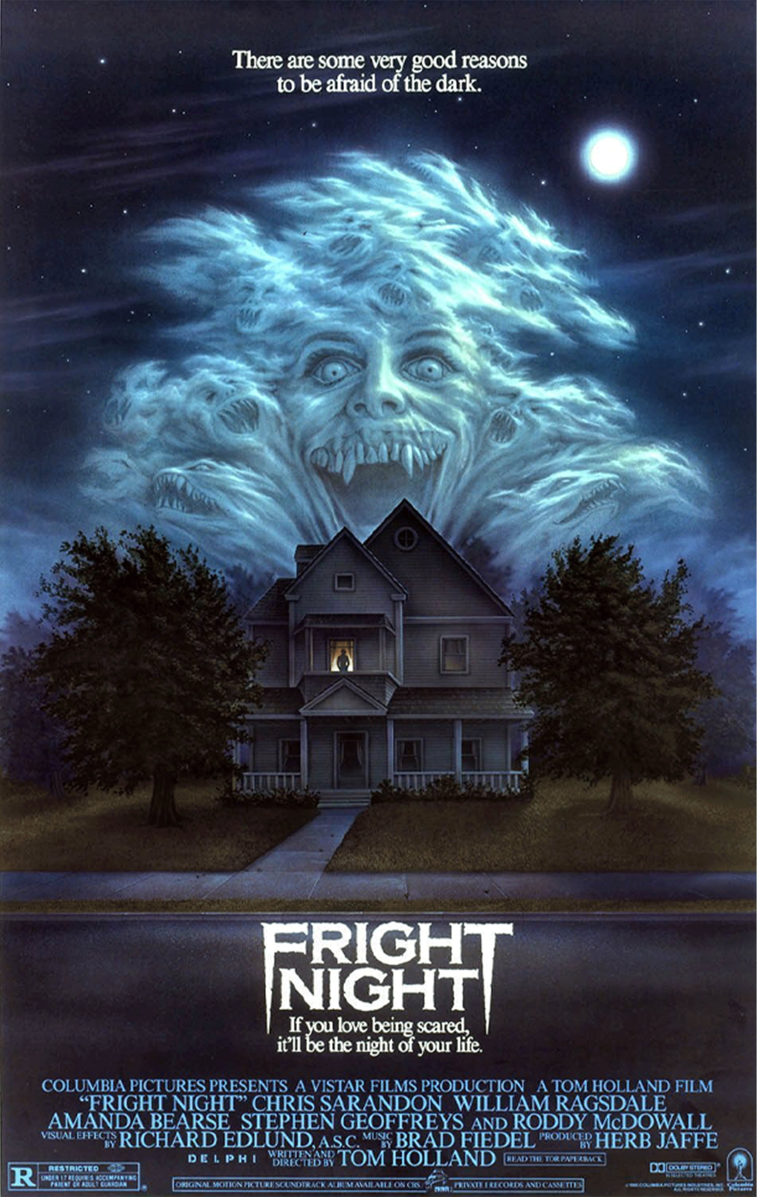
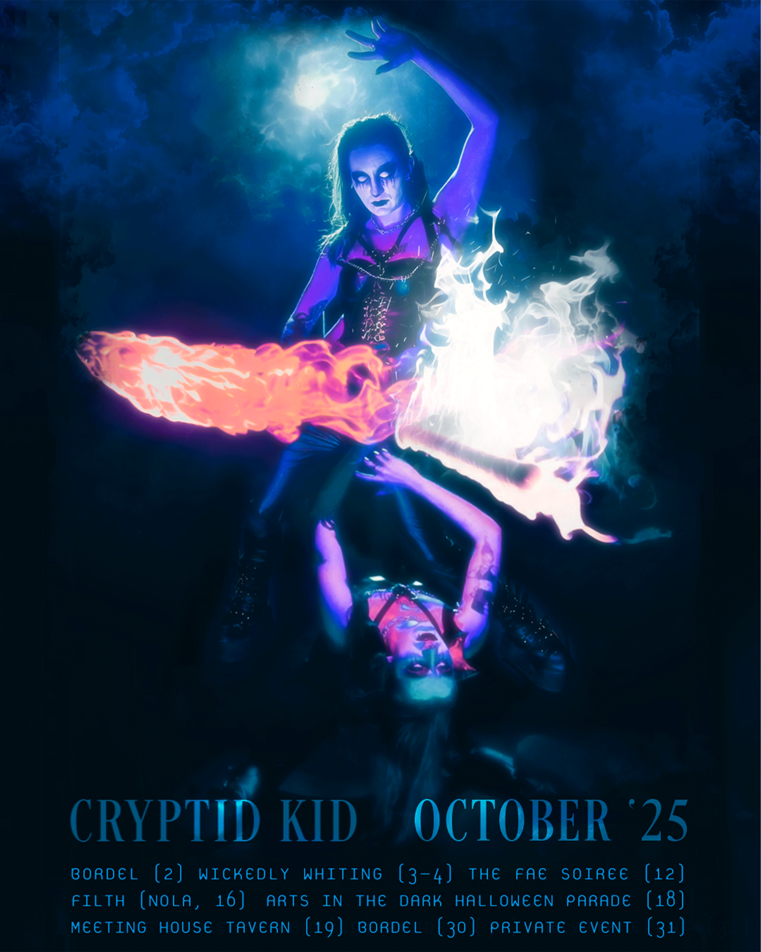
This being an October announcement, Horror was front-and-center. These two original images were both strong on their own, but mashed-up to create a terrifying, fiery, two-headed poltergeist.
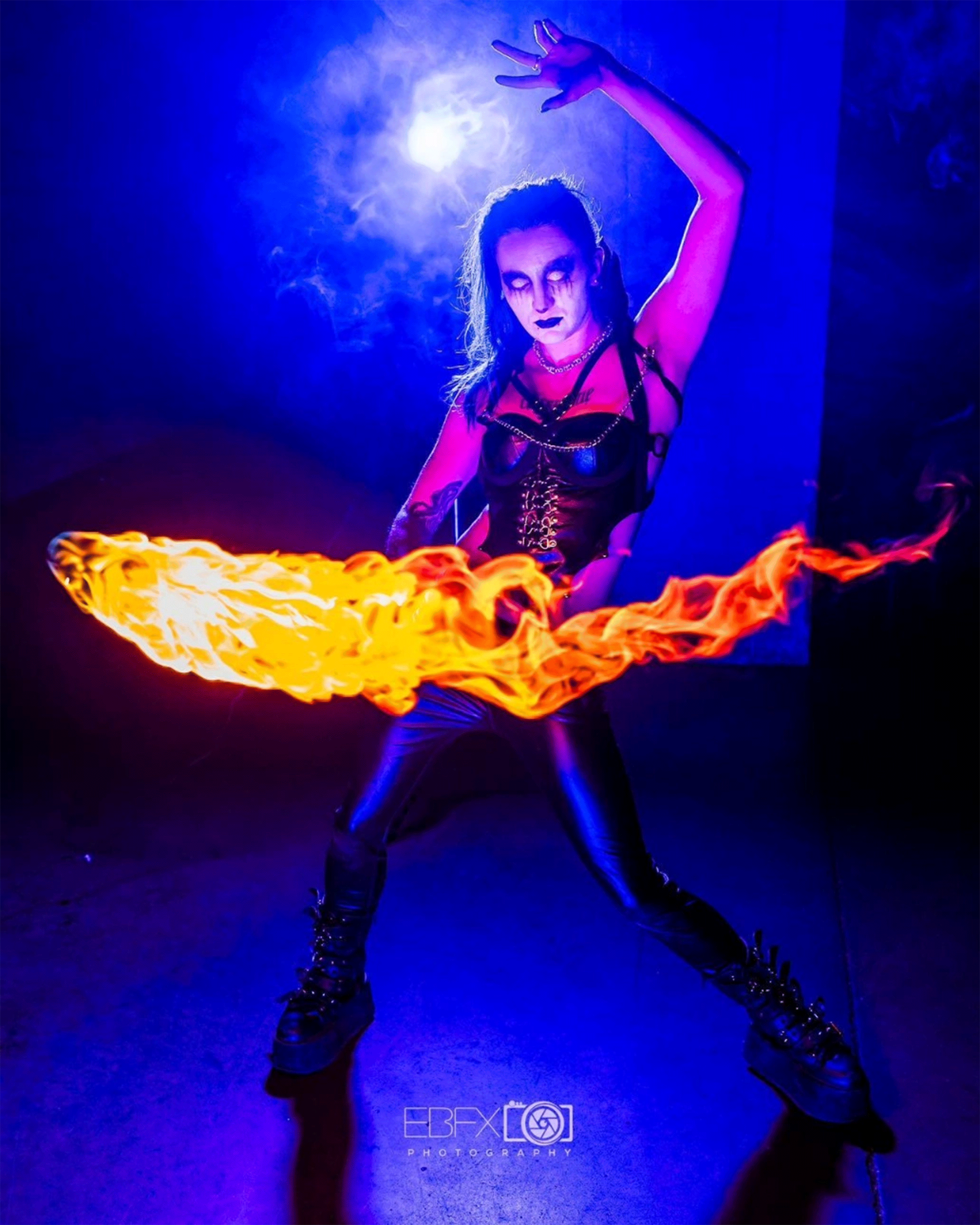
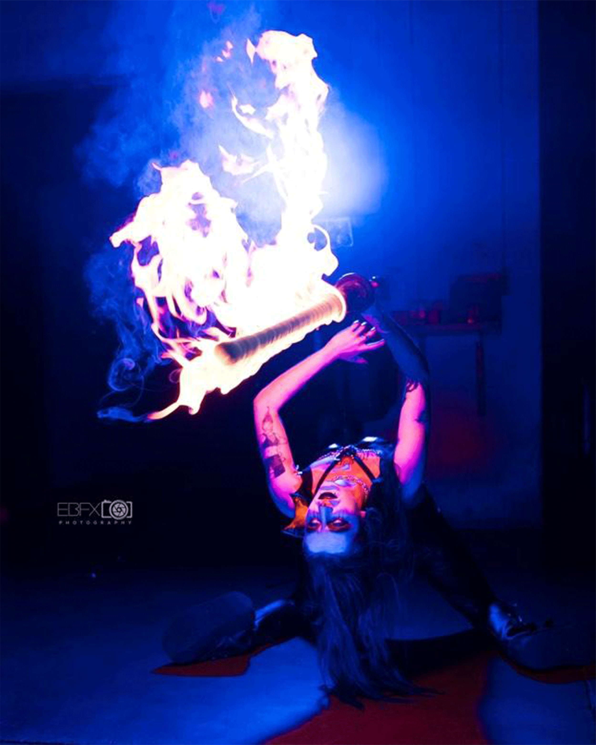
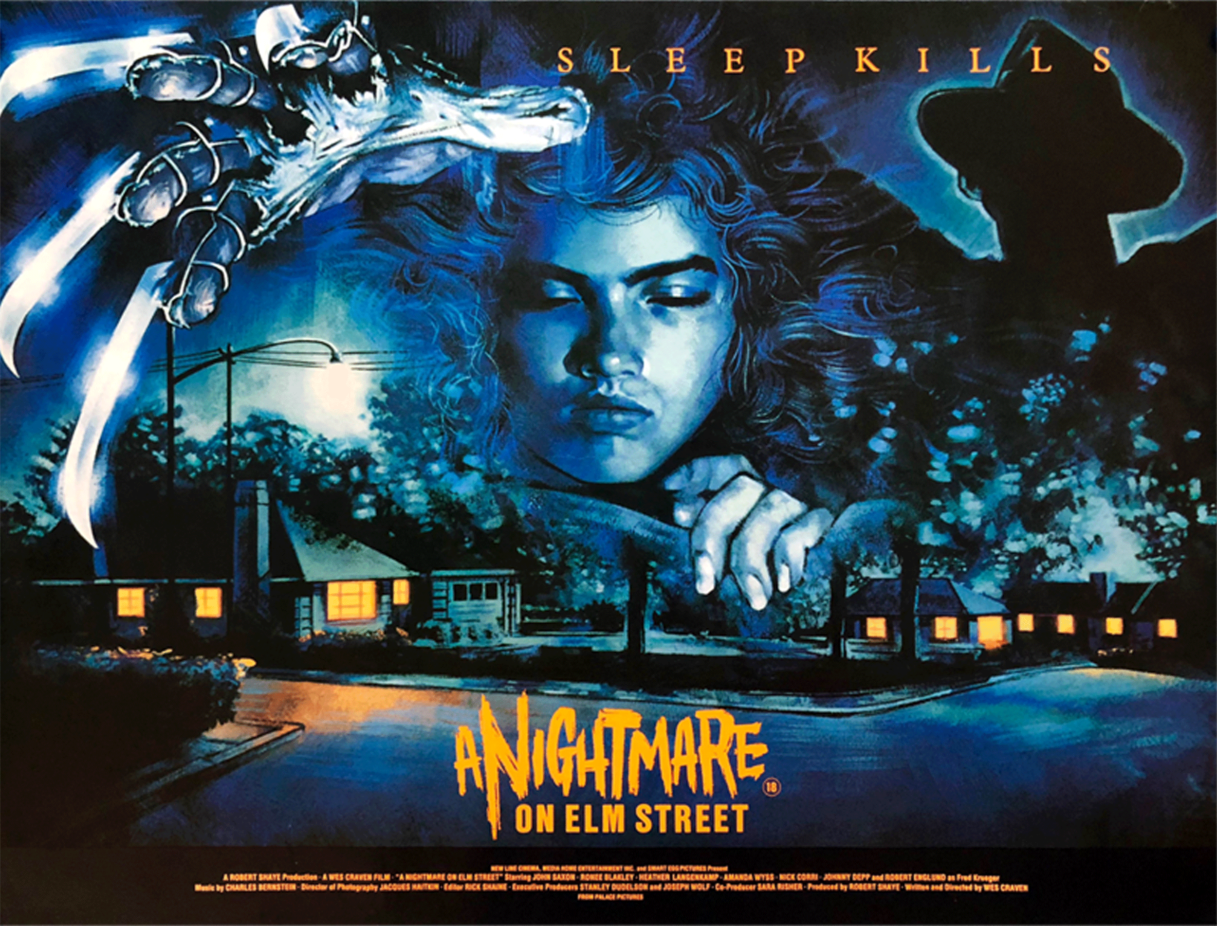
What’s a movie-poster without that classic, dramatic, blue-orange palette??
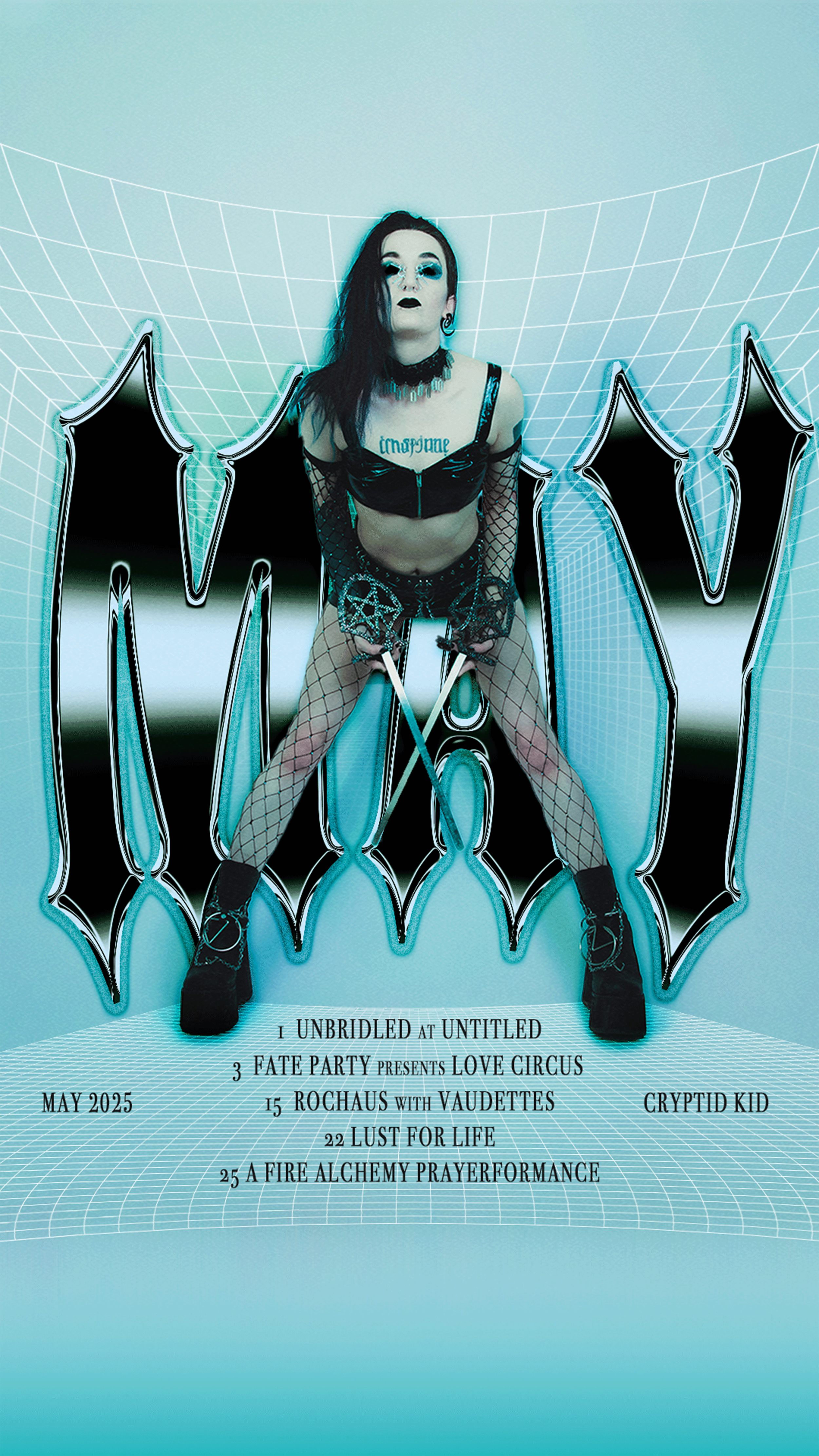
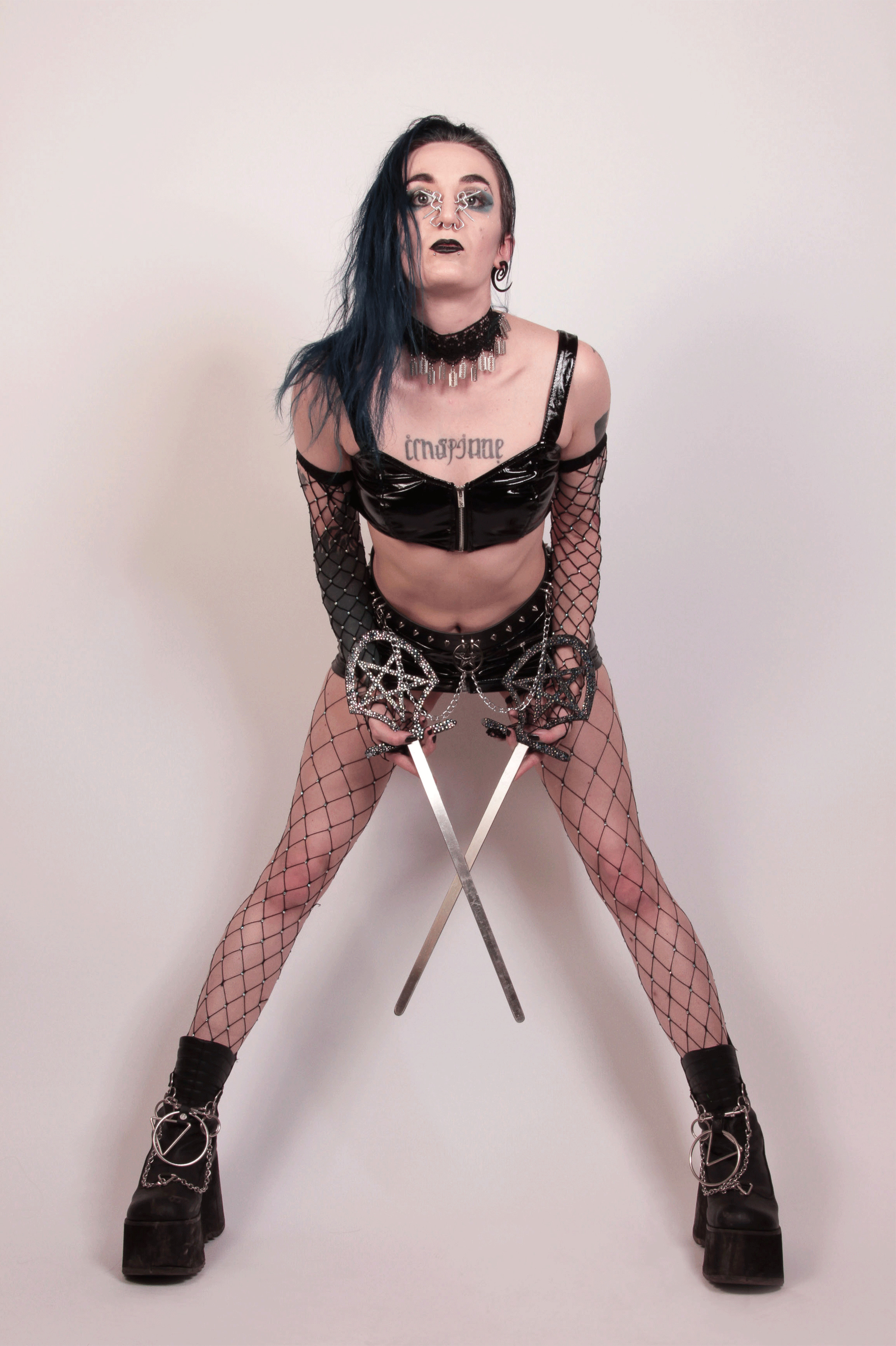
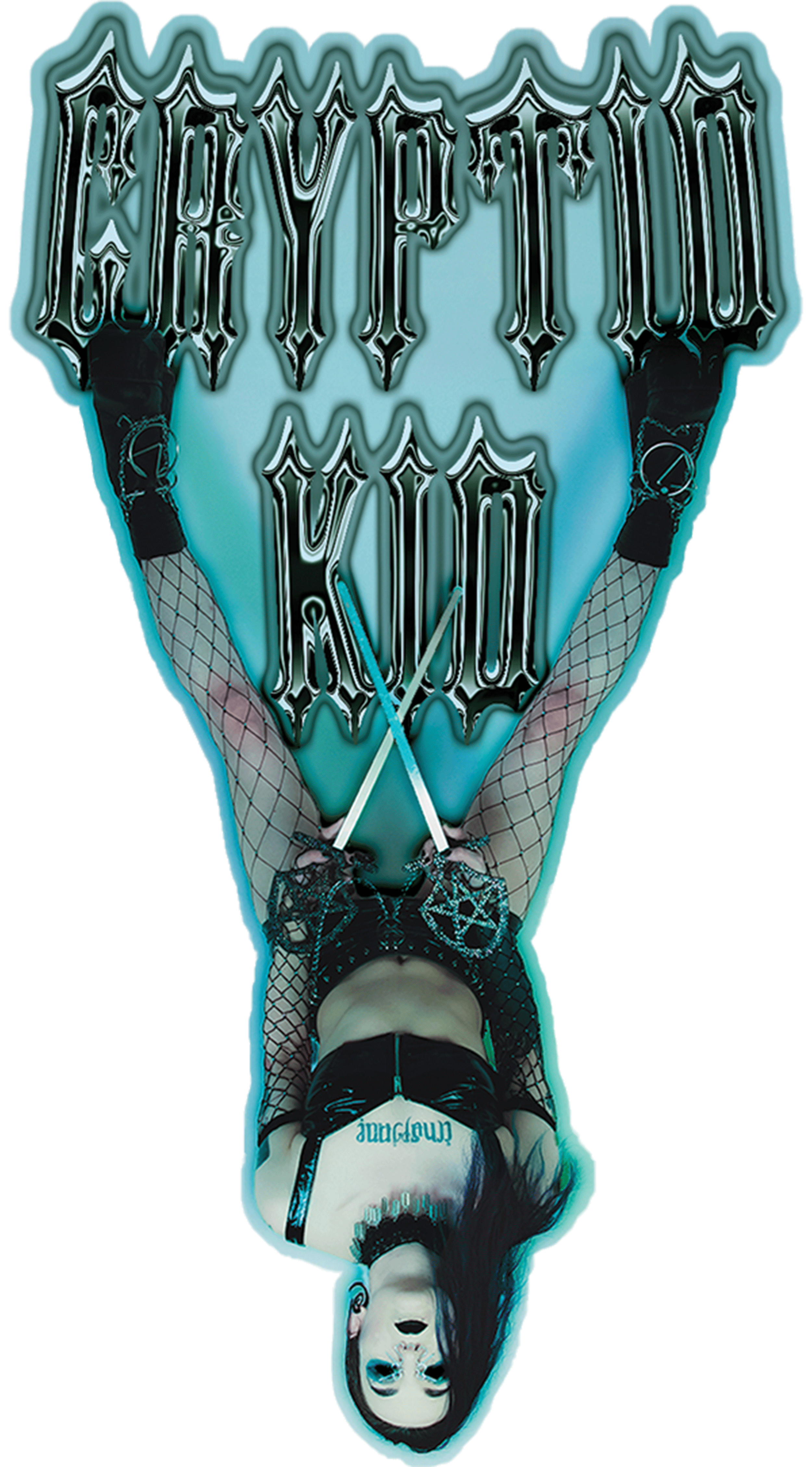
Here’s an alternative, chrome aesthetic we’ve experimented with that draws attention to their steely acts. This was another design that became a sticker/business card for Cryptid to hand-out at shows.
Originally, they were “standing” on top of the chrome text but a happy accident in Illustrator led to… Cryptid upside-down like a bat. Albeit, there was some brief debate over whether it was too ridiculous; but, in hindsight, that ‘X’ created by the blades is more prominent. Thus we’re less-likely to simply glance at them, and Cryptid can book more shows as a sword-swallower. They might also argue they’re happier as a bat.
An instance of a backstage candid-turned-poster.
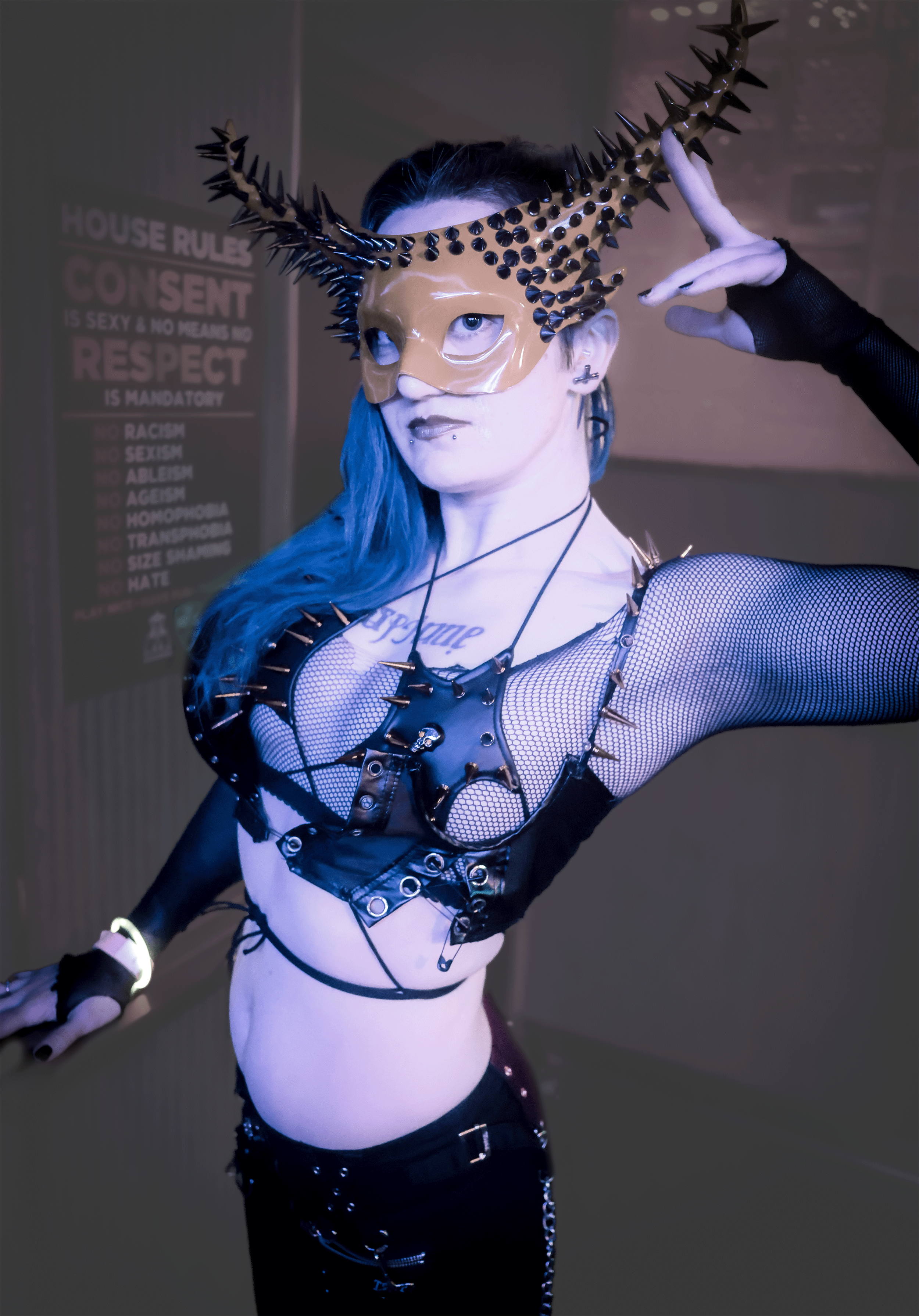
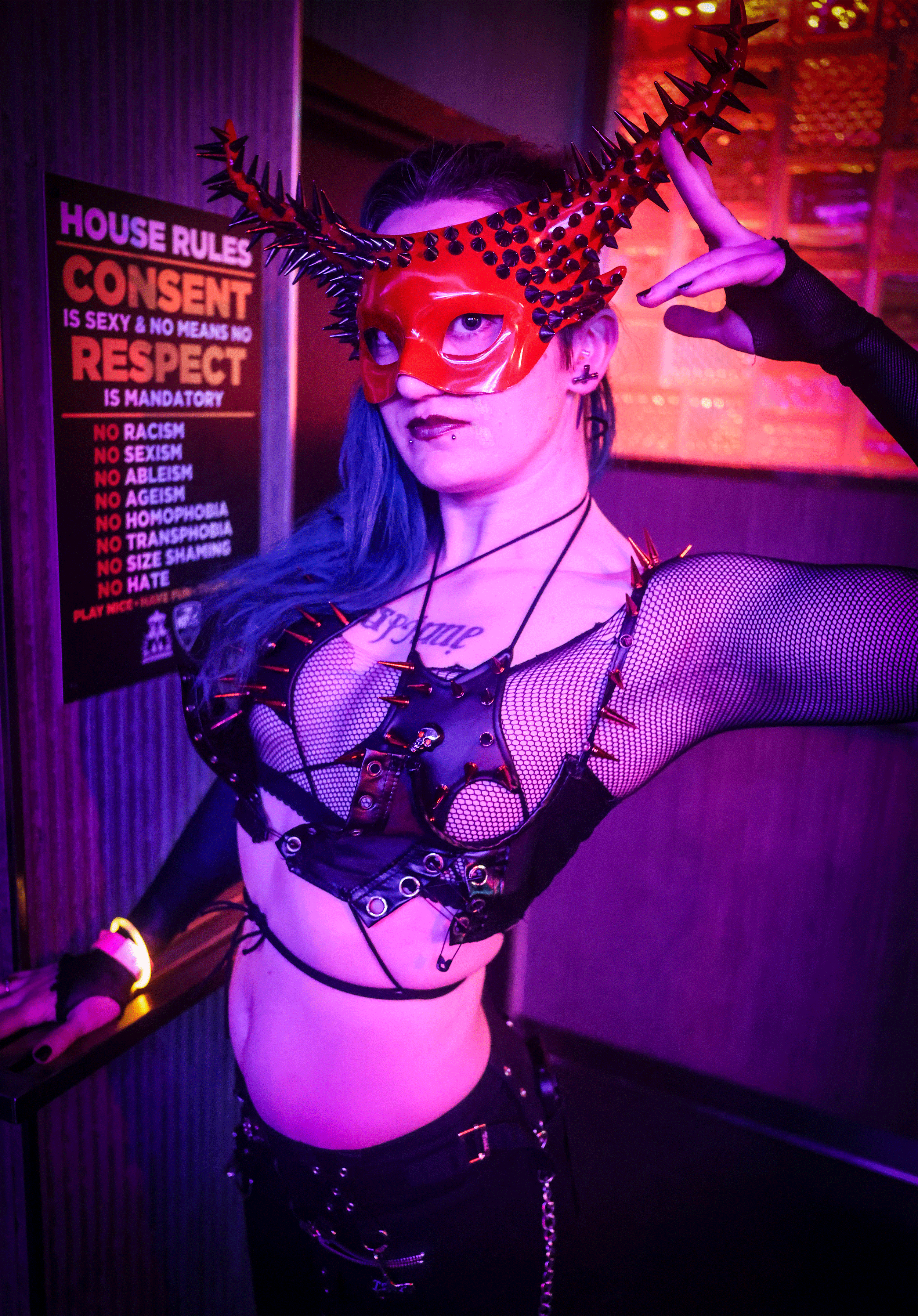
It was important to clean-up and draw any spikes clearly.
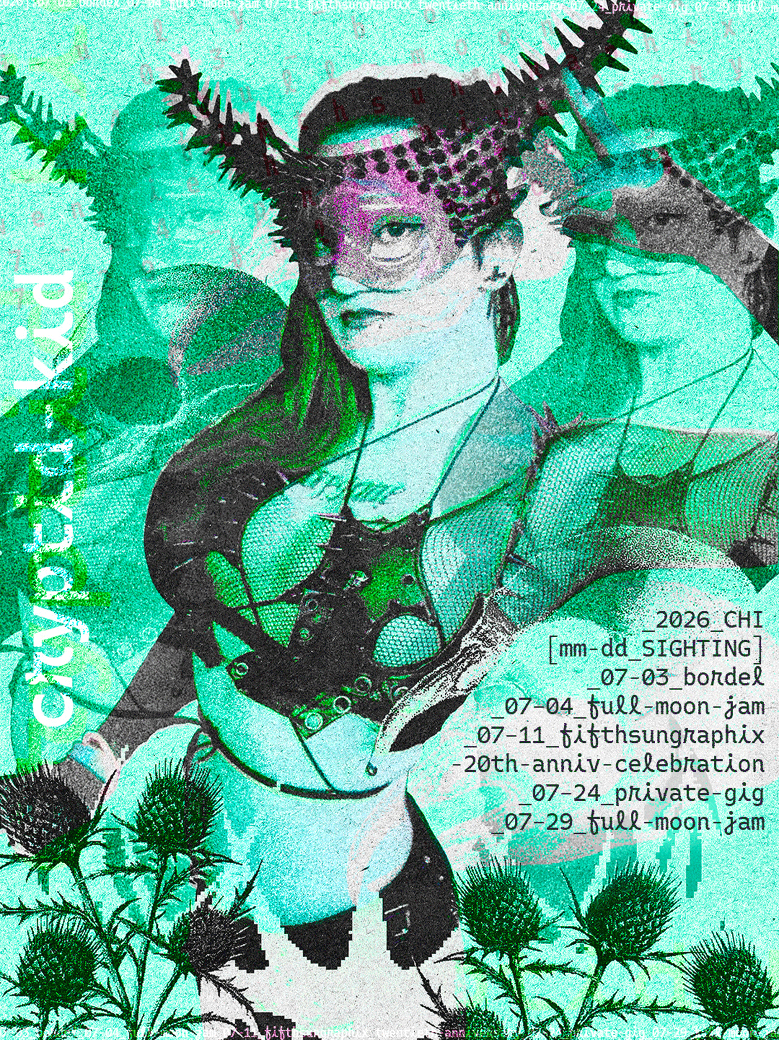
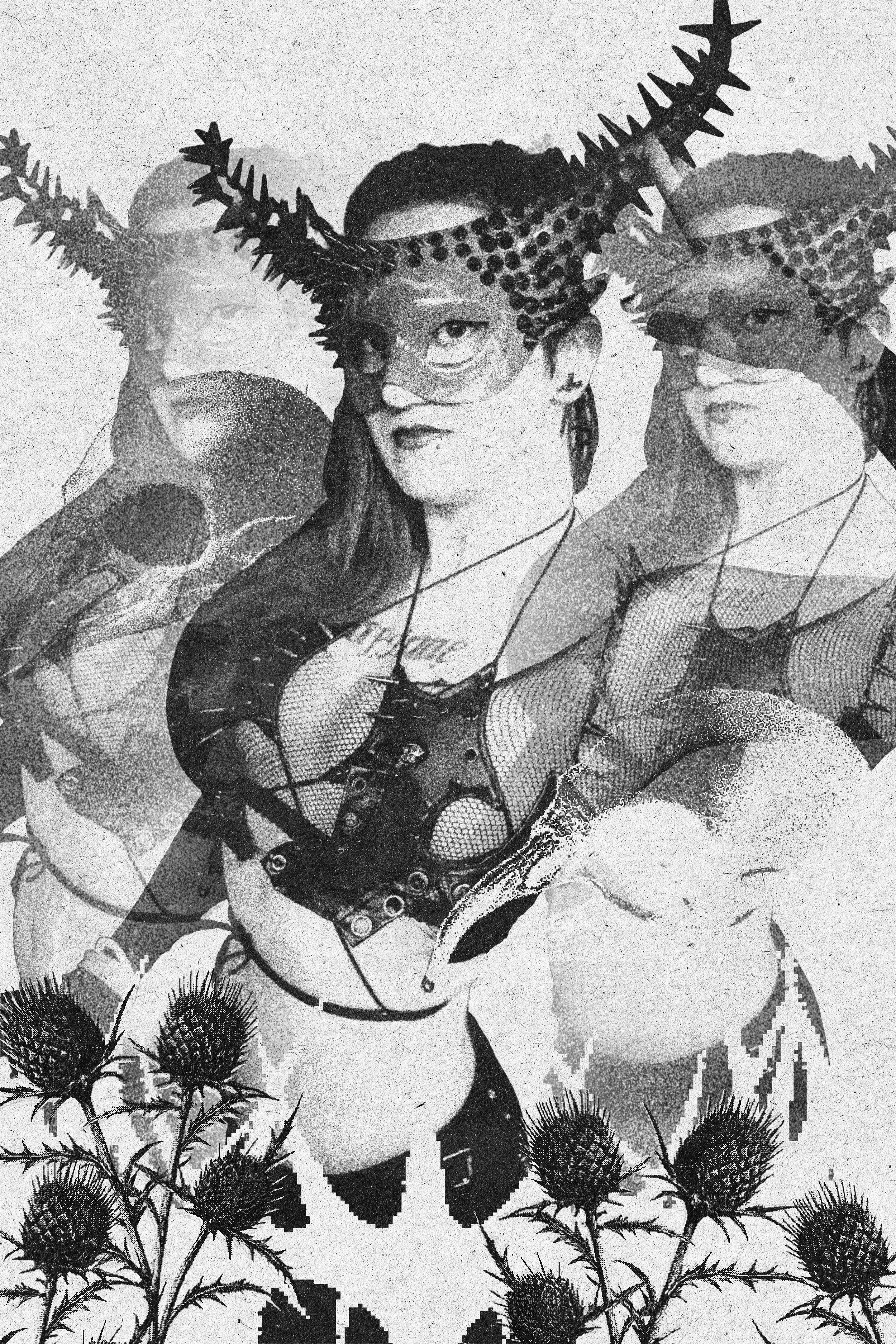
Meditating on the intersection of digital and botanical.
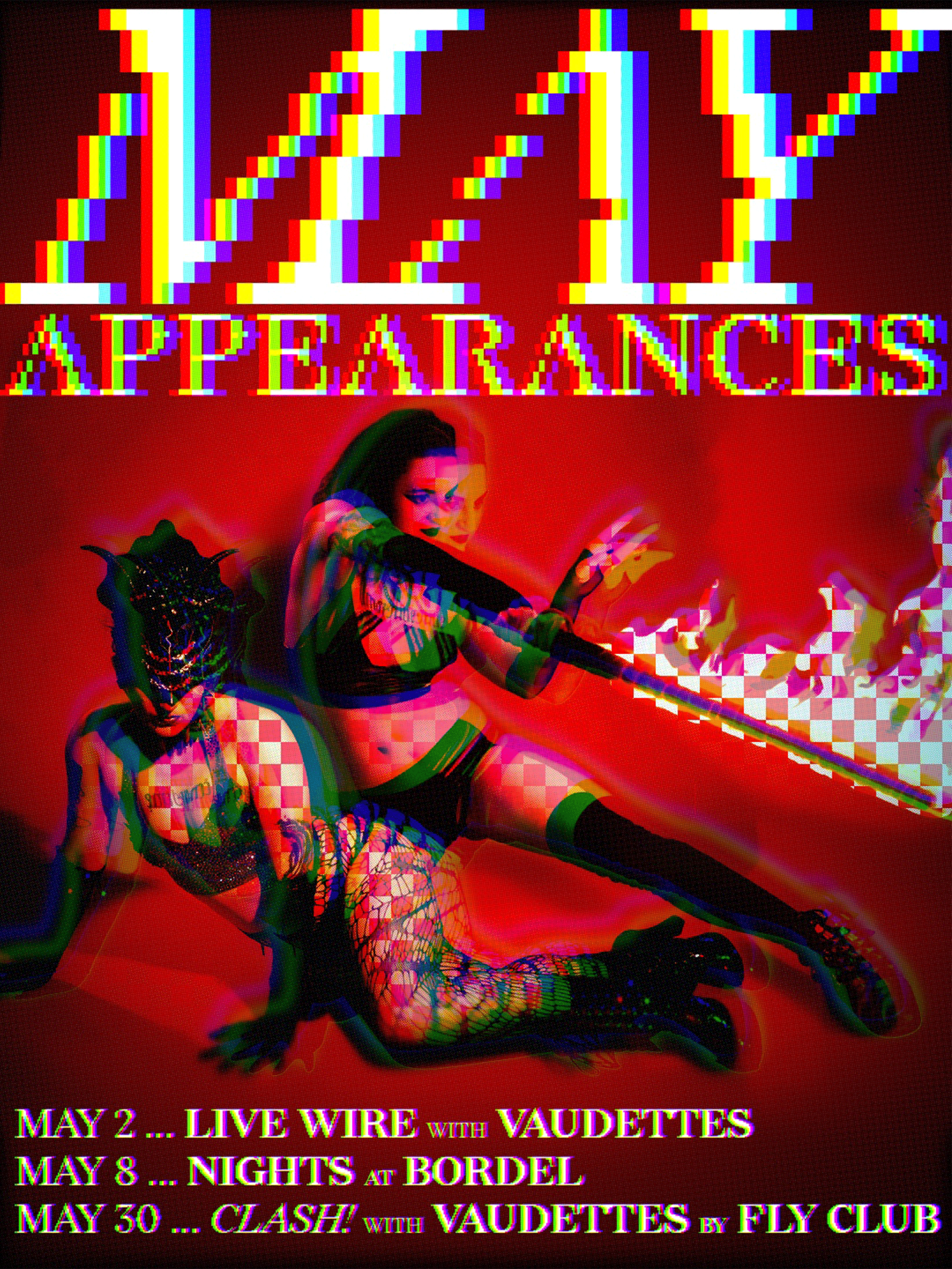
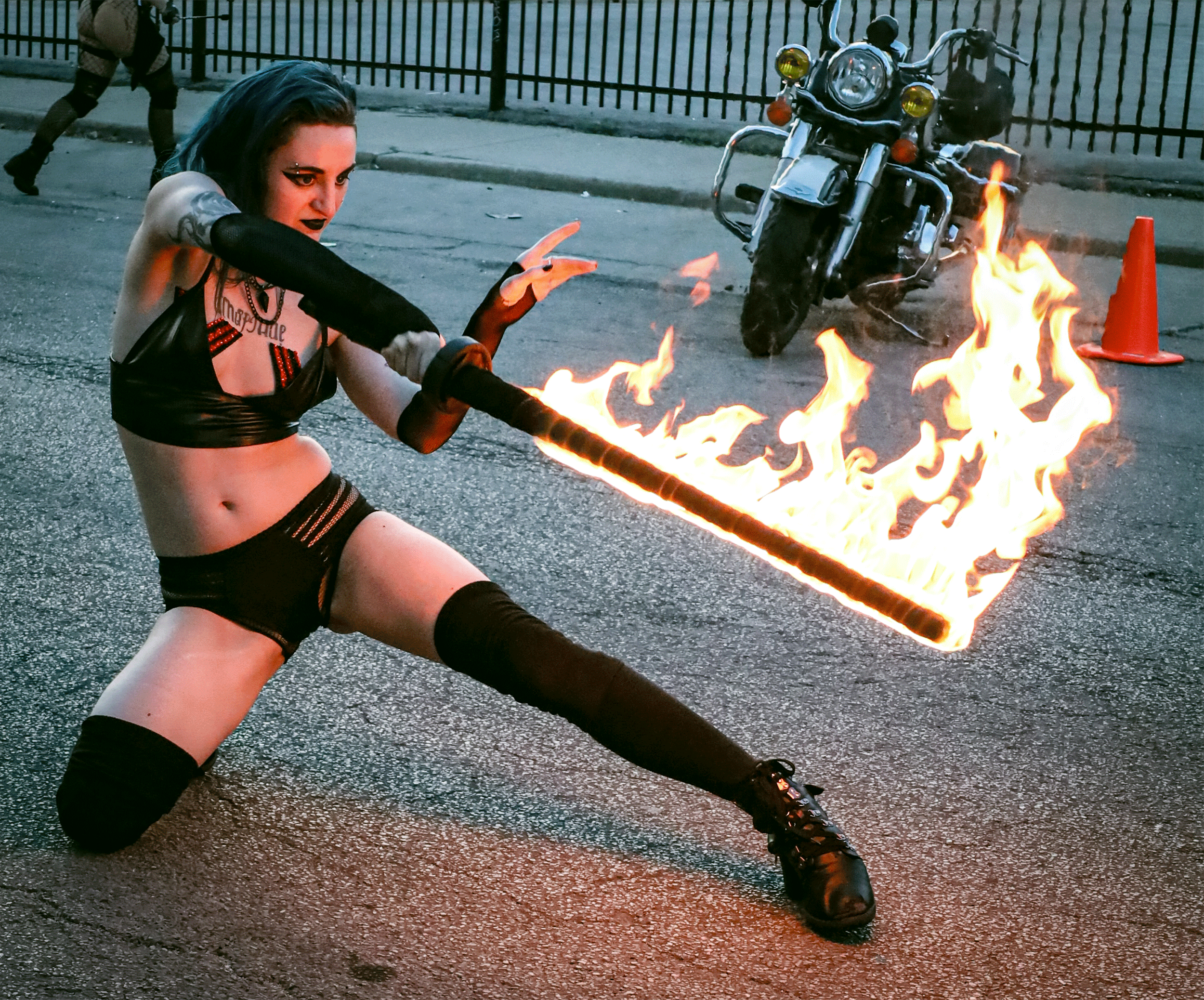
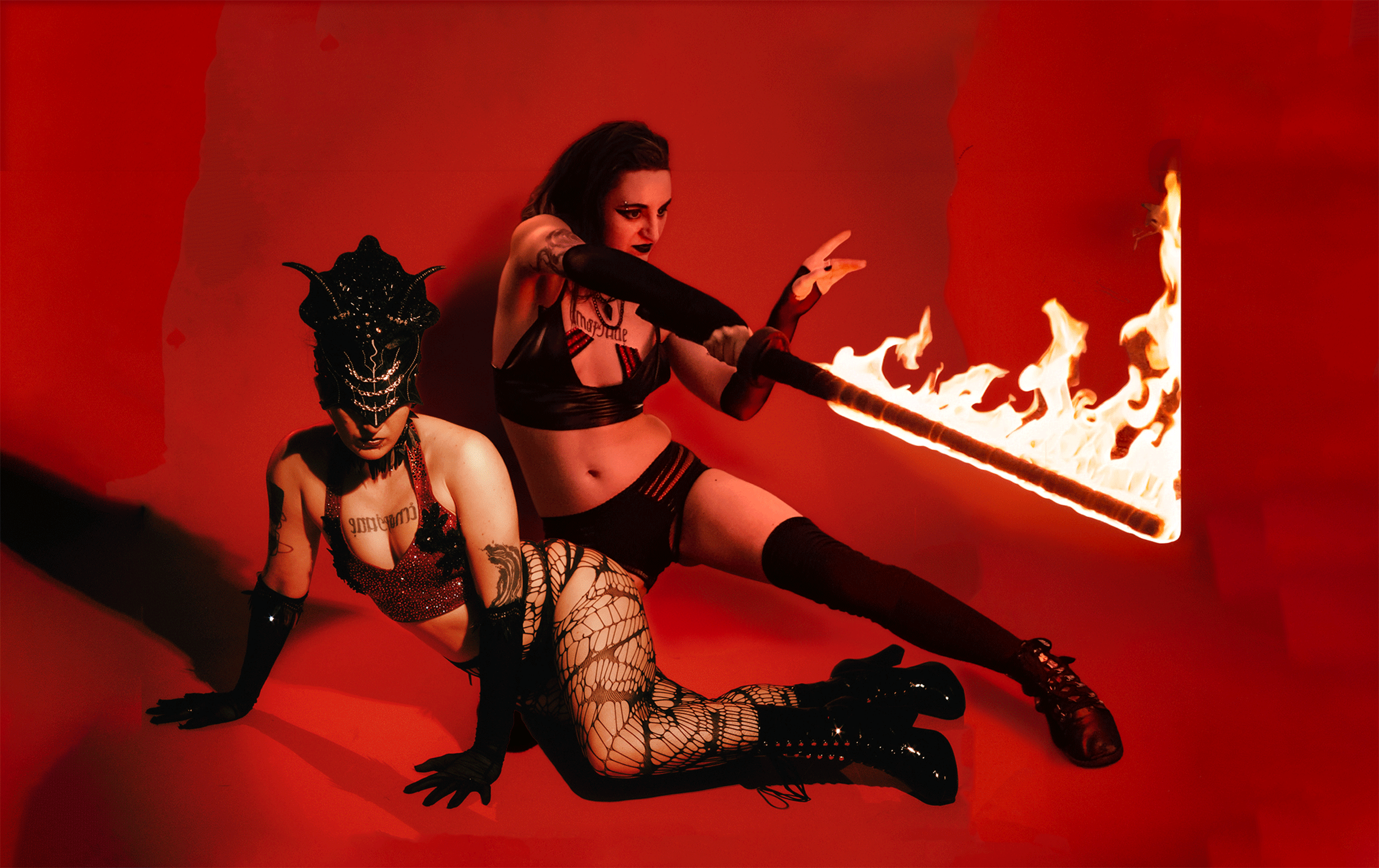
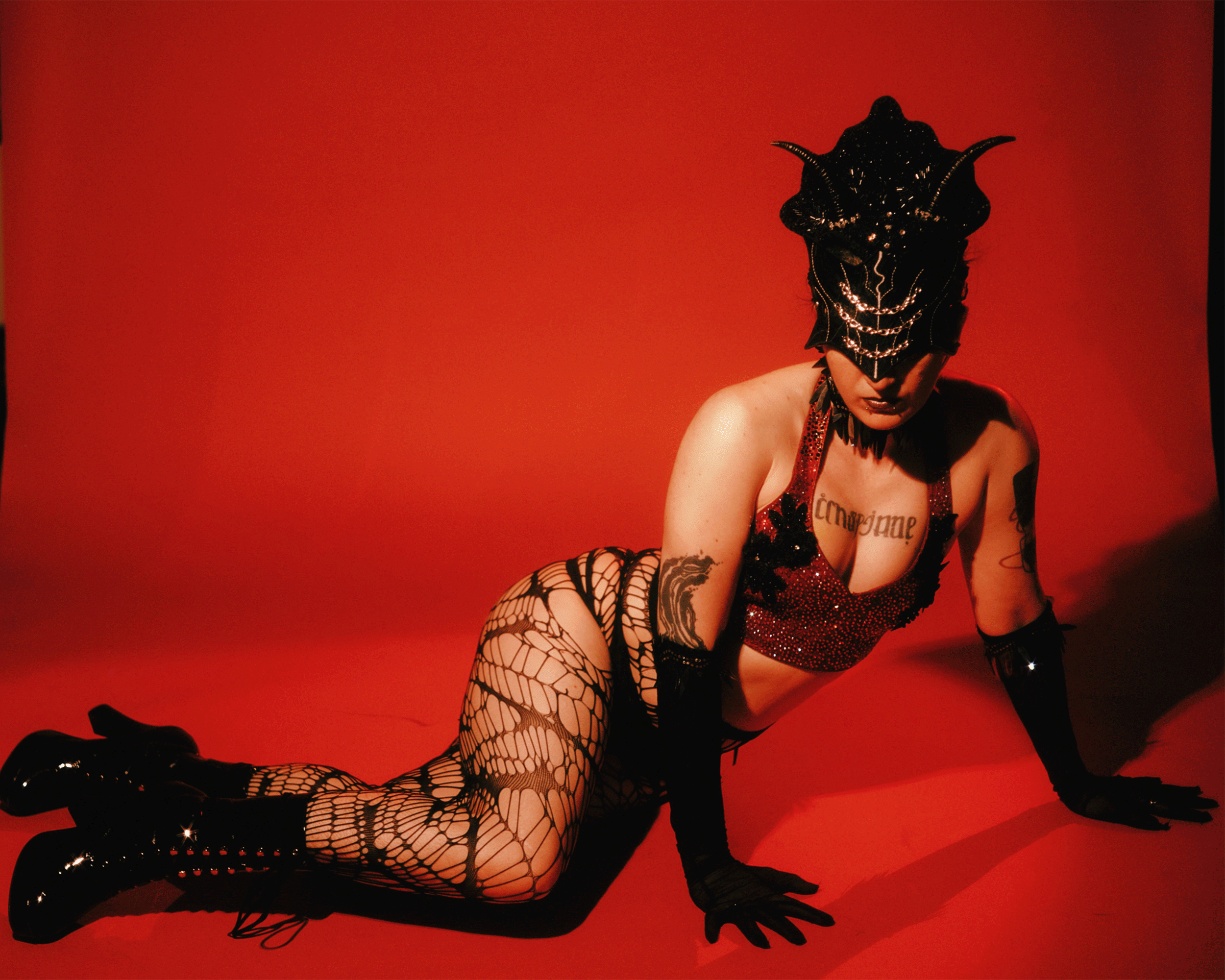
Another image mashup; this time a photo from a live performance with a studio photograph. Loosely inspired by Eve and the Serpent from the Garden of Eden—Cryptid models both roles. Instead of an apple, they’re tempted with the flaming sword in their hands (holy Biblical imagery!)
This is juxtaposed with the hyper-digital, maximally-pixellated typography.
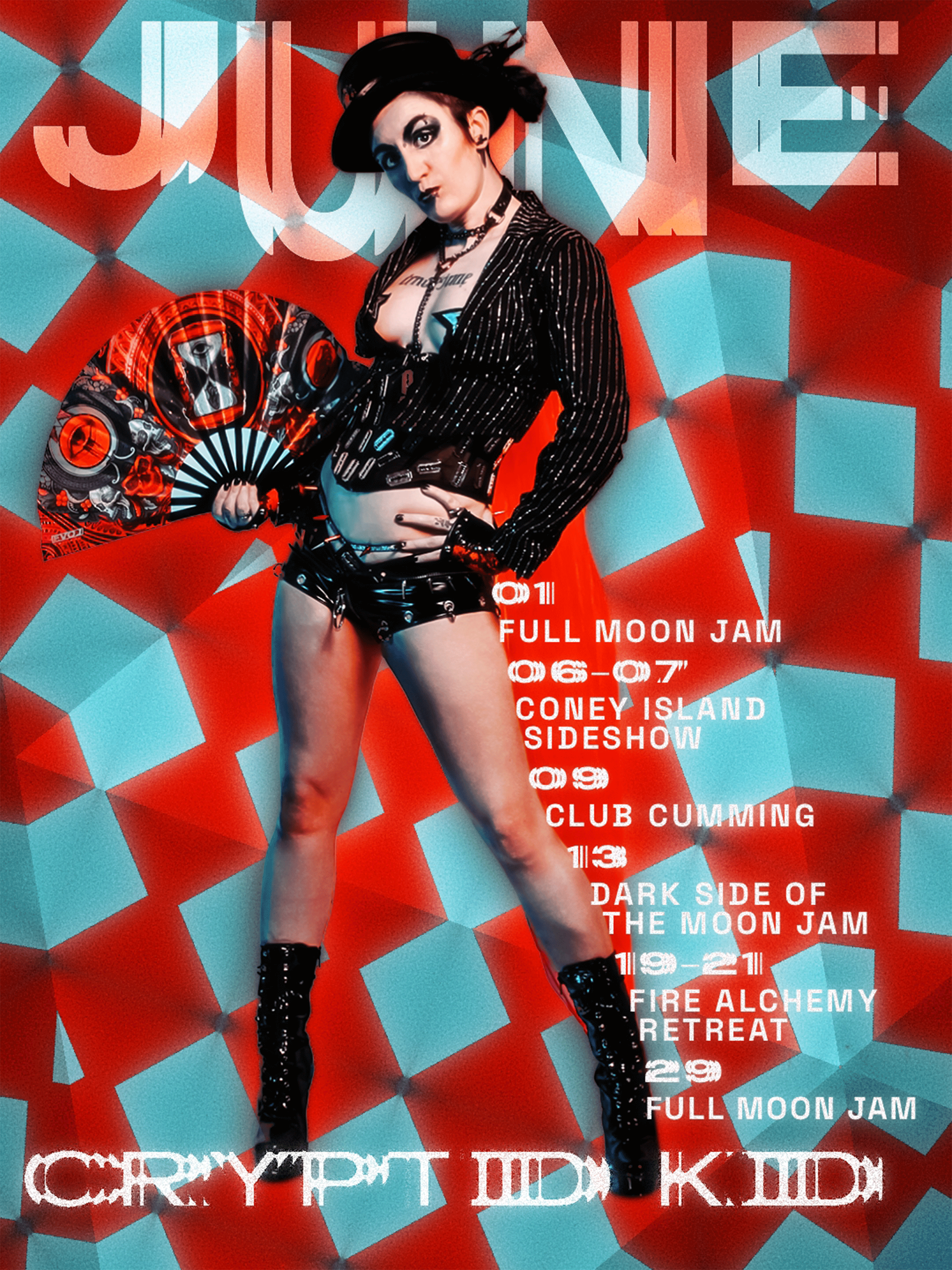
CLIENT’S CHOICE
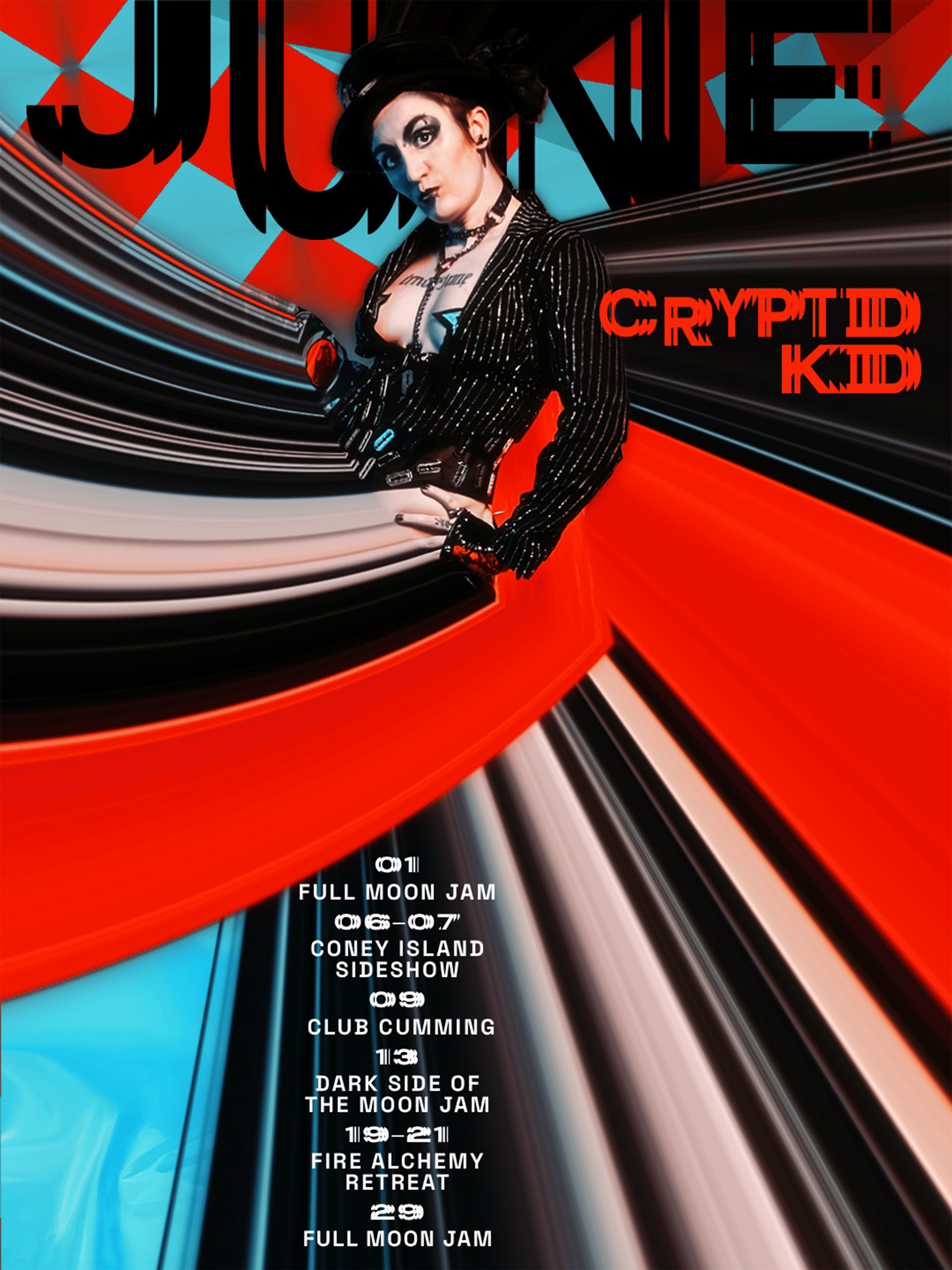
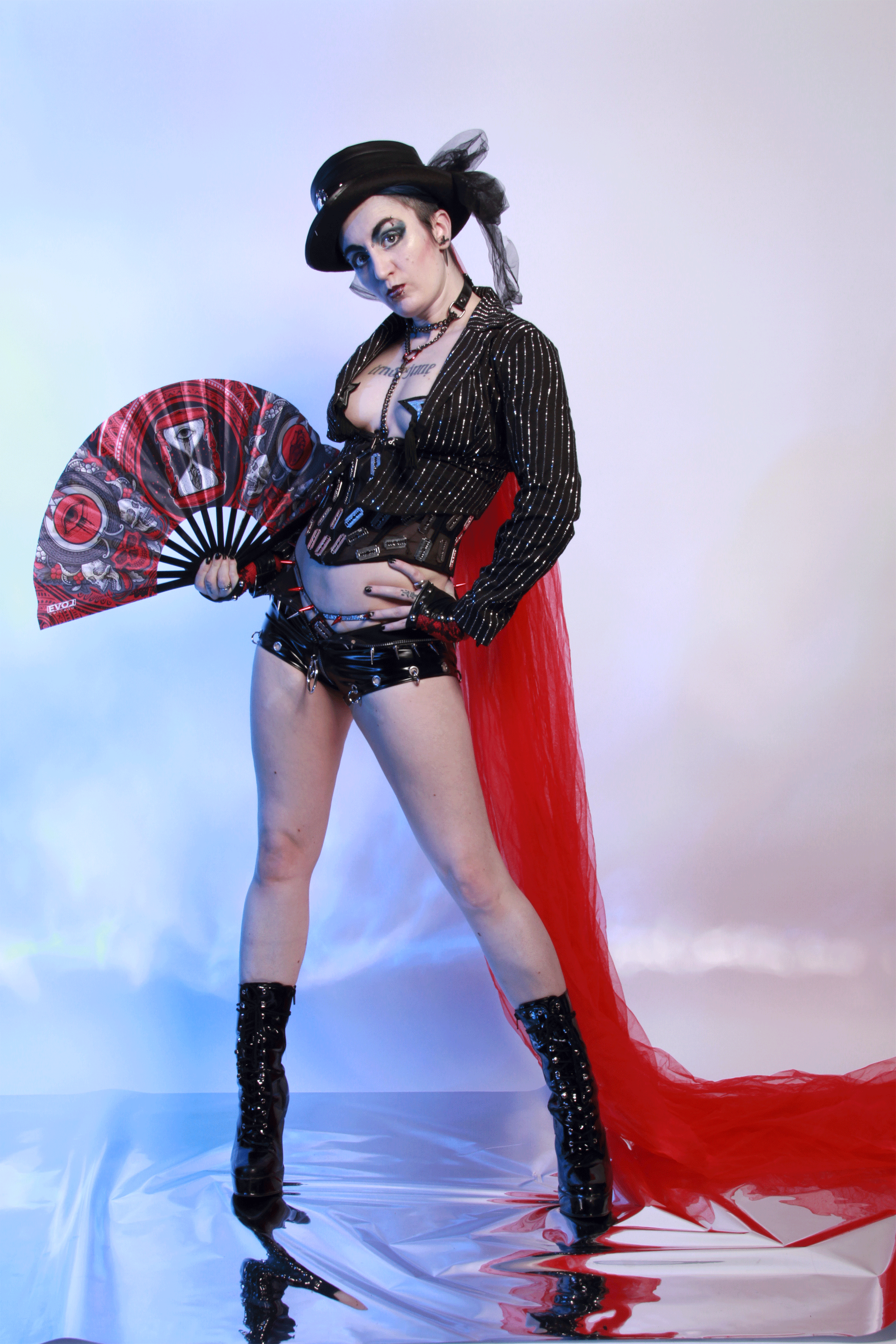
This project had two “Final” designs, and it was the client’s choice. Ultimately they published the full-body version; though, both are here to see. The nature of their posing subconsciously leant itself to a distorted magazine cover.